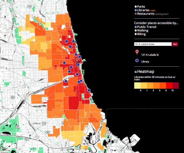
When you’re deciding on a place to live in a new place, it’s always good to know what’s in the area. After all, a house close to conveniences and things to do is usually more desirable than a house that is out of the way. InThirty, by Brian Lange of Datascope Analytics, provides some insight, starting with Chicago. Enter an address and see what libraries and parks (restaurants to come) are within 30 minutes of walking, biking, or public transit.
It’s stil fairly basic in what it does. You just get markers on the map for places that are within 30 minutes. The heat map on the layer underneath only changes as you change mode of transportation or between libraries and parks. Colors relative to your entered address could be more useful.
Still though, like with Mapnificent, I like the idea of searching for things by travel time over distance. If a couple of places are 10 miles versus 20 miles away, I don’t really care, if it takes the same amount of time to get there.
[inThirty | Thanks, Bryan]


 Visualize This: The FlowingData Guide to Design, Visualization, and Statistics (2nd Edition)

If I were unfortunate enough to consider living in Chicago, the first map I would like would be one that maps crime against neighborhood. Convenient access to various services come in a very poor second to not living in gang land…
Hey everybody, I’m the developer of this! If you’ve got feedback for us, please post it on our UserVoice forum:
http://inthirty.uservoice.com/
Or right here in the comments. We’d love to hear your ideas, criticisms, etc.
Well Chicago’s fortunate not to have a jackass like you living there. How about doing some research before making stupid comments. There are plenty of neighborhoods in Chicago that are completely safe to live in but like every large city, there are impoverished areas as well. That’s the nature of living in a city.