A couple of weeks ago, Visually, a new infographics-based startup, launched with a warm reception among all the popular tech blogs. I didn’t post about it right away for a couple of reasons. The first is that I’ve been sick for the past couple of weeks, and it’s been hard to think in between all the nose-blowing. Seriously, this cold will not die. Secondly, I wasn’t sure how I felt about the new site (partially due to the first reason). Now that I’ve let my thoughts simmer, it’s clear that Visually has potential, but it’s way too early to tell if it will actually work.
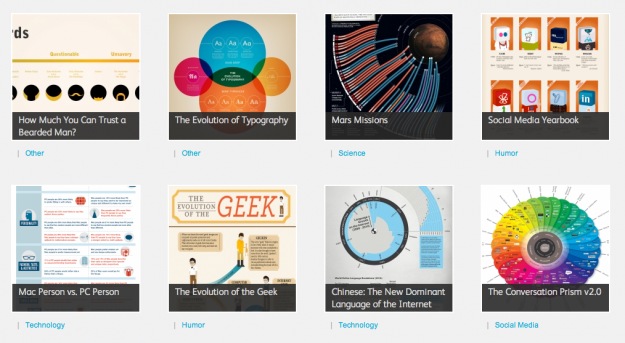
Visually has online tools in the works to make the graphic design process more approachable to the masses, but in its current state, the site is more like a design-heavy Visualizing.org. It’s a catalog of infographics, most of them designed as visual snacks, which shouldn’t be surprising considering the team. This isn’t necessarily a bad thing. I’ve posted a few of the infographics highlighted on the Visually homepage here on FlowingData. But I can’t help but feel it’s more about pretty pictures and traffic than it is about making sense of data.

Before I even got a chance to poke around the site, the general sense I got from the designers I follow wasn’t very good.
Some weren’t happy with their graphics being posted on the site out of context. Many graphics are designed to fit in with text and don’t make a whole lot of sense on their own. I get where the designers are coming from, but stuff like this happens regardless on blogs, news sites, etc. At least there’s a source link so that people who care can get more information.
The part about Visually that could be a deal breaker for many (and is worth careful consideration) is the terms of service. Correct me if I’m wrong, but this part under User Submissions seems to say that if you upload or share a graphic that you designed, Visually, or rather, something called GraphCast, is allowed to use, edit, and “exploit” your work any which way:
By submitting the User Submissions to GraphCast, or displaying, publishing, or otherwise posting any content on or through the Sites or the Service, you hereby do and shall grant GraphCast a worldwide, non-exclusive, perpetual, irrevocable, royalty-free, fully paid, sublicensable and transferable license to use, modify, reproduce, distribute, prepare derivative works of, display, perform, and otherwise fully exploit the User Submissions in connection with the Sites, the Service and GraphCast’s (and its successors and assigns) business, including without limitation for promoting and redistributing part or all of the Sites (and derivative works thereof) or the Service in any media formats and through any media channels (including, without limitation, third party websites).
The terms are actually specified for a site called graphcast.com, but all you get is an error message: “The service is not available. Please try again later.”
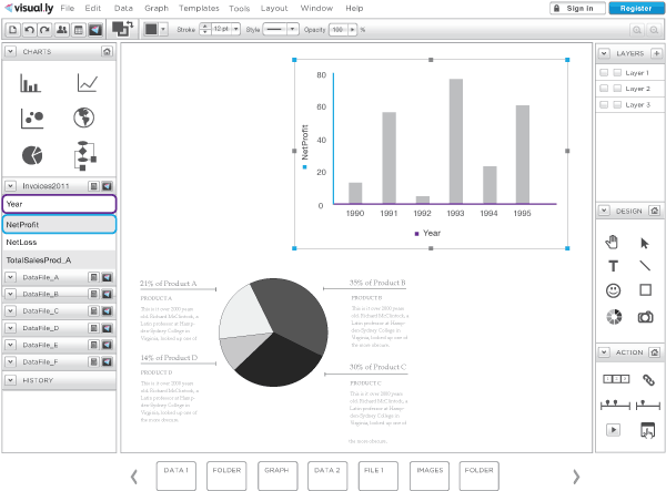
Coming back to the tool, Robert Kosara, an adviser to Visually, says that it’s disruptive technology. It looks like a stripped down Adobe Illustrator for graphs.

Is it disruptive? I don’t know, I haven’t used the tool. For the masses, it could be useful. Is it worth $100 to $250 per month? That could be a tough sell. I’m personally fine with my R to Illustrator workflow, but again, I’m not in the target audience.
I asked CEO Stew Langille where he saw Visually in a couple of years. His response:
I see Visually being the most compelling platform for data visualization. The largest community of visualizations, the ability to create and share visualizations, and an educational resource to introduce data viz to the masses. We see ourselves not only increasing the supply of data viz tools and resources, but growing the demand as well. We will be market makers for the industry.
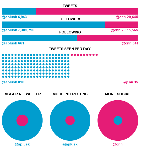
They will get lots of eyeballs for sure. The team and their partners are experts in marketing and social media, so there will be some community that develops. What type of community is still up in the air. For example, Visually has a Twitter tool that lets you compare two accounts. Enter two usernames, and you get an instant infographic. Here’s the meat of the graphic comparing @aplusk to @cnn. (It reminds me a lot of this.)

It’s great that you can get this big graphic for such little effort, but I’m disinterested. There are lots of people, however, looking for some quick entertainment. For me, Visually is one of those sites that I want to like. There’s just not enough there right now for me to get excited about it. Maybe in a couple of years I’ll be singing a different tune, but right now, there’s still a lot of work to be done.
What are your first impressions?


had your same impression (but without the nose-blowing). I couldn’t use their app so i got puzzled for so much noise for a “not available” product, i may be more in their target audience since i have some photoshop basics but absolutely no clue on how to mix a database with a chart (i mean, besides excel of course). I still dont get how this thing should be better than tableau software, so enough words for the moment, i’ll wait :)
Had the same reaction. I started the signup process, read the TOS, and promptly stopped the signup process. The whole site is off-puttingly flashy and design focused, rather than content focused. Let’s hope they pull something worthwhile out of the early mess.
You call it a stripped-down Adobe Illustrator, I call it a much more intelligent and data-ware version of Illustrator! Imagine not having to create the charts in R, but being able to do that right in the program. And being able to create whatever you want and making it respond to data, not just the typical charts you see all the time. The image is a mock-up for an early prototype, you have to add some imagination to understand what it can do.
The monthly cost is simply a question of how much time it saves you. It won’t do much for the average person, but news organizations, designers, and journalists will be able to save many times that by using a tool that’s not just a dumb drawing program. Also, there will probably be a limited free version for people to use on blogs, etc.
I agree that the TOS need work, and I think they’re going to change soon.
@Robert – That’s why I said “for graphs” at the end. It looks like a graph-focused, stripped down Illustrator. I think the flexibility of code will always keep me grounded in my own workflow, because it’s how I “interact” with data and explore it. It’s a totally different story for a mass audience, of course (e.g. Excel users?).
But like I said, I can only go off of what I’ve seen. I’m still eager to see what’s next.
“Creating a much more intelligent and data-ware version of Illustrator” is by far more easy for, say, a company like Adobe which has been working on that great piece of software for over twenty years, than a over-hyped start-up like visual.ly. There’s a huge difference between creating data visualizations and creating data visualization tools.
Also, you think journalist or news organizations would pay a monthly fee for a software they have no control over? Guess you haven’t worked with those guys a lot.
I too had a similar reaction.
The “explore” section is a rehash of a lot of old(er) material – little of it very interesting outside of quality design (which is worthwhile in itself in some cases).
The “share” section made me think “why should I share here?” so I didn’t even get to the (rather nasty) TOS.
The unfinished “create” section is interesting, but I’m the wrong audience I think. I’d be very surprised if this tool can accelerate my current process (variety of analysis tools – then into Illustrator for static and Flex for dynamic pictures). Were Illustrator to make even a half-hearted effort at their charting package, I suspect it would be hard to beat. That being said of course, nobody has seen this new tool – maybe it’s brilliant. Though (maybe I’m old-school) no serious professional will rely solely on a web service to do their job. Am I really strung in terms of tools if I’m on an airplane? The cloud for storage is one thing, but apps that don’t go offline are a nonstarter for me. I also think the hundreds-of-dollars-per month price tag is a non-starter. Doesn’t take many months to get to the Adobe CS Suite price… That price tag struck me as absurd (I assumed it was a typo at first!) Nonetheless, I’ve signed up to be kept in the loop, and will be curious about what they produce.
At the moment I don’t see a need to add visually to my toolbelt, but I’m still interested in seeing what momentum it gains and if/how it responds to any criticism. Robert Kosara wrote a post http://eagereyes.org/blog/2011/visually-the-future-of-data-based-infographics on visually that’s worth a read.
We also abandoned the registration after reading the TOS.
Thanks for all of the comments here. Our intent with the community is to provide a place for everyone in the dataviz community to share their creations with the widest possible audience. Like any community, what it will become is largely up to you.
We’re just getting started but we will be adding support for interactive visualizations soon. We take our role very seriously and will be actively promoting dataviz standards and publishing a code of ethics. Happy to hear from the community on what you think that should include.
Visual.ly’s terms of service are standard for UGC (user-generated content) sites. That said, we are currently reviewing them due to the concerns raised here and elsewhere. Look for more news on that soon. We’re also exploring the possibility of adding Creative Commons licensing.
Thanks Lee. I’ll keep my ear to the rail.
Making sense data and creating visualizations to engage people is something I consider as a fundamental right of all human. For this reason I’d rather spend my time in creating open source visualization tools than giving the smallest support for a company that tries to make people dependent on a closed source software service.
Great review, Nathan. I was baffled by the droves of great press on visual.ly as well. In the time I spent perusing the graphics shortly after launch, I was underwhelmed – seems like a larger proportion of eye candy than graphics aiding in information discovery. It will be interesting to see if the early apparent momentum continues.
I too was not excited about Visually’s TOC and did not sign up because of it. When I contacted them on Twitter about it I got no response.
@cole, I’d like to invite you to upload any graphics you like to Visually. Or point us in the right direction and we’ll get them up. We’re always looking to improve the quality of graphics on the site.
@martha, I think you mean terms of service, which is discussed here. But if you still want to discuss, reach out to me on Twitter. I’m @lsherman.
Thanks Lee, I did mean TOS. My point wasn’t that I was still looking for an answer, but that the community manager for the Twitter account was unresponsive. I be sure to follow your twitter handle instead for further updates.
sorry, i wish the dudes success in life, but i think there’s nothing disruptive here. it seems nothing more than inserting oneself as an organizational middleman between talent and clients. the great press is because people are assuming these guys were responsible for mint’s success. for the most part, mint’s “infographics” were ugly, gigantic images with 25% info and 75% graphics. occasional ones by jess3 and others (who already have careers and don’t need visually to make them) took off.
the talent is already outside the box. people can keep biting nick felton, yau, few, or others, and making tools that look like the latest issue of the feltron report, but it will always miss the bigger point.