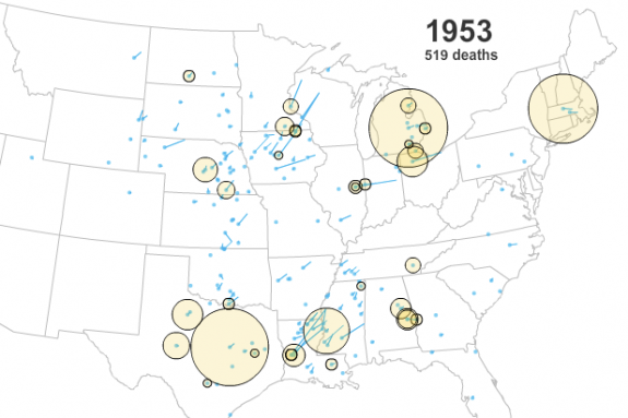
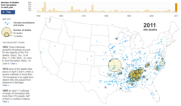
As reported by The New York Times, the tornado in Joplin, Missouri, known to have killed at least 100 people, makes 2011 the deadliest year of tornadoes since 1953 (519 deaths). There have been over 450 tornado-related deaths this year. This NYT interactive shows number of deaths per year with yellow circles and tornado touchdowns and paths with blue lines and dots.
Above is the view for this year. Below is the view for 1953. In contrast to 2011, the majority of deaths in 1953 were mostly due to several powerful tornadoes that touched down in Texas and Michigan.

[The New York Times via @nytgraphics]


If you move the slider to play the movie, there are obviously more blue dots beginning around 1990. Were there actually more tornadoes in recent years, or is it simply that we’re getting better at detecting/recording tornadoes, especially ones that occur in rural locations?
@Glenn – You’re right on that one. From the footnote of the NYT graphic:
“2011 deaths are by county; deaths in previous years are grouped by tornado. The number of tornadoes reported in each year has increased — especially in the mid-1990s — as the National Weather Service modernized and improved its field operations.”
The difference in the tracks between 1953 and 2011 is striking — some of the 1953 ones traversed entire states and must have been on the ground for hours, but in 2011 there are no tracks of any significant length at all.
Tom,
The difference in tracks is probably not that the tornadoes in 1953 actually stayed on the ground for hours, but rather, the equipment then tracked storm cells more than individual tornadoes. Which also implies that there were actually more tornadoes in 1953 than are reported. I am certain that we now “see” more tornadoes than we previously did, but I also believe that there has been a steady increase. Coupling that with the increase in population density skews the numbers a bit.