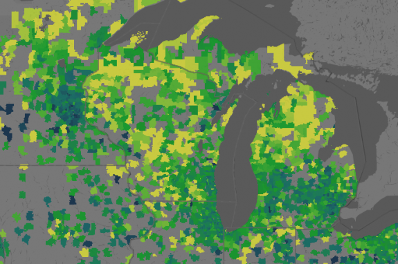
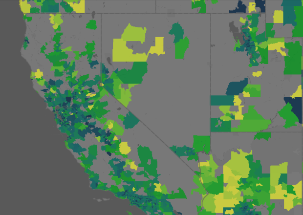
Shopping for a house? Sometimes it can be advantageous to wait a while, and the price of the house you’ve had your eye on might drop. It’s all about getting the most for your money, right? The Trulia Price Reductions Map can help with that. It shows the average number of days until house prices tend to drop for the first.
Yellow areas on average stay the same price for 120 days or more. Blue areas change after about 30 days. You can also view average percent reduction and the probability of a second reduction.

The maps are speckled, but zoom in on major areas, and they look more like maps of where people want to live. This makes sense since houses will usually sell quicker in areas where people want to live. If a house isn’t purchased right away, then it’s probably priced too high. Conversely, areas where there aren’t many potential buyers to begin with will wait longer before reducing housing prices.
[Trulia via The Big Picture | Thanks, Barry]


One fascinating thing about this visualization is the way it’s implemented. The canvas version of the code works by shipping a raster map of zip-codes to the browser, then letting the browser do the colouring in Javascript. Very clever and flexible technique by Sha and Zain at Trulia. I wrote up a description on my blog at http://www.somebits.com/weblog/tech/good/client-side-map-filtering.html