 During production of the 2011 USAID annual letter from Rajiv Shah, someone said to someone else, “We need to make this more visually appealing. Let’s add some charts.” The problem was that there wasn’t much data to look at or report, and no one knew how to dig deeper. Plus — they had to sexify the letter in a hurry, so they settled for what’s there now.
Your mission, if you choose to accept it, is to find the mistakes and to make suggestions on how to improve on what’s there. Some figures clearly have a few oddities while others simply could’ve been improved with better design choices. Here’s the letter and the same as a PDF. Can you figure out what’s going on? Leave your findings in the comments. Godspeed.


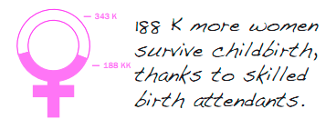
omg.. its so bad! Why compare midwives to total pop, shouldn’t it be number of midwives per women in a certain age group? The mobile banking chart is just wrong. The pink chart – 188k more lives saved than 1990 – if 188k out of 344k total births survived as the ‘pie’ chart suggests then everybody died in 1990? I hope they’re better with handling charity money.
It’s all wrong. Banking chart is confusing, is tha bank-going population a part of the phone owners?
Some of the charts apples are compared with oranges, I get it, it’s all about people, but how can I see if 350 midwifes are enough or not for 10M people (however that seems a little low)? It’s the number of people having or not having access to midwifes that should have been compared with the total (female with the proper age) population.
Rising food prices are not that much rising compared to 2008.
But the SIDA and especially the childbirth victim’s charts are the worst. What is the total number of casualties? How many child birthes? Is the colored or the white part the positive result?
In all, confusing. I get the hand drawn style, but
1.) they should have gotten their numbers right
2.) they should have been more clear with their choices of forms and relations
3.) They should have chosen proper colors (see the funding chart with the red line, or the black dot for the midwifes)
We Don’t Know How
Author: William Paddock
Should have made the challenge to find the visualizations without mistakes. :p
1 million/6 million is not the same as 10%/60%
I could be wrong, but looks like food prices DECLINED in 2008.
The AIDS ribbon is completely uninterpretable as a data graphic.
The mirror-of-venus graphic shows “188 KK” women surviving childbirth. Not sure what the second K is for!
What’s up with the injection graphic? Aside from making me jumpy just looking at it (and taking me back to latent subconscious fears of going to the doctor’s office), where is the comparison to 1990 actual numbers? Why is the maximum number only up to 5M? Surely there are more children than that. Gah!
My simple, non-professional take on these numbers:
http://i1109.photobucket.com/albums/h440/schubertmalbas/myreconstructionforUSAID2011.png
I don’t know if that’s enough, but at least the illustration is accurate. The reconstruction would not have misrepresented the data. Besides, this is the kind I often see in news magazines.
The USAID letter alone does not contain enough data to construct charts. The USAID letter should probably give links to the data, so that readers could verify the claims.
Oh my this is bad. Most of the data graphics are really off in their ratios. Take the aids ribbon in the “Lives Saved Compared to 1990”. The white part should be almost 3X the size of the red part. As it is, it’s about 1.2 or maybe even only 1.15X the size. It makes you wonder if anyone really looked at the numbers, beyond seeing which one was bigger.
And as a designer, this is just really sad to me. The total lack of consistency in the colors (I seriously think they about used all the colors in the rainbow), layout, and typography is really awful. There is some important information in this document but because of the horrible design it makes me not want to read it. It just feels very amateur.