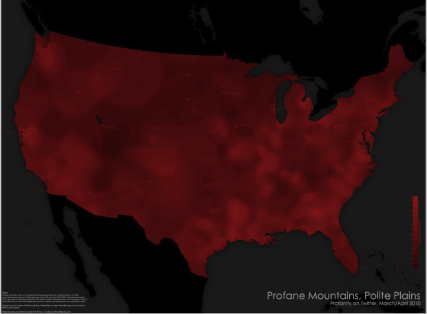
Cartographer Daniel Huffman has a look at swearing in the United States, according to geocoded tweets:
Isolines are based upon an interpolated surface generated from approximately 1.5 million geocoded public posts on Twitter between March 9th and April 12th, 2010. These data represent only a sample of all posts made during that period. Isolines are based upon the average number of profanities found in the 500 nearest data points, in order to compensate for low population areas.
The brighter the red, the more profanities used in the area, and the more black, the less swearing. Words looked for were (pardon my language): fuck, shit, bitch, hell, damn, and ass, and variants such as damnit. Honestly, I never swear like this. Unless some idiot pickup truck tailgates me going 80 on the highway in the middle of the night. That doesn’t count though.
Notice the patch of darkness in Utah?
Twitter should do stuff like this. The real-time stuff across significant events is great, but using tweets as a cultural barometer is even more interesting, I think.
Check out the high-res PDF at Cartastrophe.
[Cartastrophe via @awoodruff]


If you overlay the population density of the US, you will find that swearing is more common in areas that are more densely populated. (duh!) If you map the number of twitter profanities per 1000 inhabitants, you might get a clearer picture. (assuming twitter is equally popular everywhere in the US.)
Population may generate more cursing. If you curse in the woods and no one’s around to hear it….
I know Canadians are milder-spoken, but I never expected something this stark. Wow, not even Quebec.
Um, they did normalized against population – they actually went one better and normalized against local levels of twitter useage: “Isolines are based upon the average number of profanities found in the 500 nearest data points, in order to compensate for low population areas.”
You’re kidding right? “Where people swear in the United States”. Canada (and Mexico) are blackened out because they weren’t studied.
The patch of darkness is the Great Salt Lake.
Well yeah. The patch of black is the Lake. Most of Utah is pretty dark though.
Oh scrud. Now you know my flippin’ secret Utah vocabulary.
okely dokely howdy doodly
I would love a tool where you could see tweets about some current event or happening. It would be fascinating to see how information moves across the population over time.
@Clare – there’s this…
https://flowingdata.com/2009/10/07/trendsmap-shows-twitter-trends-geographically/
http://bit.ly/9sygF0
here’s a real time 3d map of twitter around the world. I bet it could be changed to show real time cursing as well…
Shouldn’t this be normalized against (or masked by) some generalized map of cellular network coverage? I’m assuming that the majority of georeferenced tweets are generated by smartphones, so no coverage means no observations in the dataset.
Can we overlap the following layers on the map?
1) Population density
2) University density
3) Blue state – red state
Does anyone else notice the giant mountain of swears there in the Ark-La-Tex Region, and the other one that appears to be centered around Saginaw, MI?
Isn’t the patch of darkness in UT the Great Salt Lake? I guess there aren’t too many people tweeting from their boat on the briney waters. :-)
Very cool map. Only critique is that they could have used better colors and not had black as unstudied areas and lakes as well as low profanity.
I second that. They should have used a more distinct gradient of colors. Perhaps 5 instead of too many. Cool concept, not executed especially well.
Yes, I can clearly see the difference between the 321 tones of maroon red.
Hi Leo,
Not being able to see the difference is actually part of the design. Because of the limits of my sample (only gathering tweets during one part of the year, only able to make use of geocoded tweets, etc.), I don’t want people to be able to be able to feel too certain. If you look at your neighborhood and see a rate of 6 profanities per tweet, I don’t want anyone to think that this is exactly 100% always true. Instead, the general pattern of light to dark is the critical thing.
Wish you could show a map from 1978 when the LDS president allowed African-Americans in to the priesthood. It would have been the reddest state of all.
XOXO
ex-mountain bell operator.
That can’t be totally accurate. Washington DC should be bright red. :-)
I really don’t see how you couldn’t include things like dick- and cock-variants, cunt (and its variants, if it even has any, I guess) wouldn’t be included in this. Also, if bitch is gonna be used, seems fair to throw in bastard. Oh well. More meaningless data to bring up at the bars next week.
fuckin’ awesome!
Shouldn’t it really be called “Profane Plains, Polite Mountains”? Without doing a real analysis, it seems like the flatter areas of the country are the ones with the highest density of swearing tweets.