Last week I found out that the FDA has a feed for all product recalls and market withdrawals since 2009 and an RSS feed with details. I did a quick search to see if anyone had done anything with the new source of data but didn’t find anything very useful. So to scratch my itch, I banged this out over the weekend.
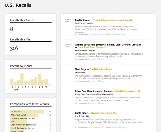
It’s a more data-ish version of recalls that gives a bit more information than just a plain feed. You’ve got recalls over time with navigational bar graphs (based on this tutorial by Wilson Miner), and you can filter by company or month. What company has the most recalls? What’s the most common reason for product recalls?
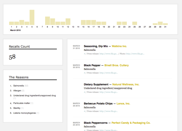
The above are recalls for March of this year, mostly due to Salmonella found in some Hydrolyzed Vegetable Protein manufactured by Basic Food Flavors, Inc. Here’s what the homepage looks like:

Salmonella is by far the most common reason for a recall since 2009. There have been 789 cases to date. The second most, with only 97 is that an allergen was found.
It’s simple, but useful, I think. A lot more can be done though, like including images of products and companies, etc. There have been suggestions linking recalls to lobbying. Also, it’d be nice if data before 2009 were in there, but that’s all the FDA’s XML provides, and I don’t have the time to parse out the HTML.
Anyways, if anyone wants to take it a step further, I’ve put the django apps on Google Code. There are two apps. One handles the scraping, and the other displays the data. Templates and media are in there too.
Thoughts on how to make this more useful? Leave ’em in the comments below.
[Recalls]


I like it! Is this still in draft fromat? I am wondering in the section named Companies with Most Recalls, are the bars on the left behind the text indicative of something? There’s a couple title case discrepancies and the link to US goes nowhere, but for a quick bang out, this is wonderful!
It would be neat if you used a spry collapsible (sp) section so when you mouse over Recalls this MOnth and Recalls this year, it shows a box on the top of the left (above the blog-type thing that’s there now) that gives details. Then if the user wants to investigate more details they click the Recalls number to hold the box in place and then they could click into the details in the spry box.
Yeah, those bars indicate the number of recalls for that company since 2009. What link to the US are you referring to?
Very cool. Allow the user to split out food from pharmaceuticals, or biotech and med devices. Now that would be very, very cool.
Then, make it a mobile app. Pharma & device geeks, as well as docs, regulators would love it!
Good idea. Someone needs to get on that :)
Brilliant! I’m looked at this data a number of times (and follow the @FDArecalls tweet stream), but somehow it never crossed my mind to come up with a better presentation for it. Slick work.
Great one! I am currently looking at a Recall case study for the use of notices and how notices could be improved to reduce the costs and risk by reaching more people. Is it possible to put notification dates, costs, impact, etc. (anything about notice) in there?
Awesome. So nicely done!
Where is the pre-2009 data (html) available from? This is a nice project, if I have some time I wouldn’t mind writing a parser.
@Pierre – that’d be cool if that happened. all of the recalls since 2004 are available here:
http://www.fda.gov/Safety/Recalls/default.htm
Love how nice and clean this is. The consistency of colouring so we can always find the clickable links in yellow is good.
I would be inclined to change the scale on the bar chart by company to a year view rather than a month – more likely to see something interesting that way. Would also be cool to have the same rollover effect on the links in the “Companies with Most Recalls” chart.
Well impressed that you “banged it out over the weekend”!
PS ‘Withdrawals’ is usually spelled with two ‘a’s!
Missed that one. Thanks, TuesdaySue.
Bravo! You’re really adding a lot of value to FDA’s data by revealing some non-obvious trends. Way to serve the country!
As someone who works closely with the government, I feel obligated to point out that the gray text in the interface is too gray to comply with color contrast accessibility standards—so, you’ve certainly made recall info MORE accessible, but a few color tweaks would take it to the next level.
You can check your color contrast compliance at http://www.hp.com/hpinfo/abouthp/accessibility/webaccessibility/color_tool.html
Very cool. Thanks for the tip, Jed.
This is what we need in public health!