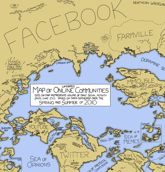
xkcd + numbers on online communities. Need I say more? Along the same lines as the Web 2.0 Points of Control, xkcd maps online communities with fictitious regions sized by the amount of daily social activity. Beware of the Bay of Flame in the Blogosphere and the Northern Wasteland of Unread Updates in Facebook. Personally, I like to hop between the Twitter and YouTube islands.
It’s most interesting when you compare it to the 2007 map where MySpace, Yahoo, and Windows Live ruled the land. I guess things are a little different nowadays.
Make sure you check out the large version.
[xkcd | Thanks, Elise]


Pingback: Map Of Online Communities 2007 and 2010 « Simon Says
Keep in mind that the 2007 map and the 2010 use different data to determine area (user quantity vs. user activity). So the size comparison isn’t direct.
excellent point.
Pingback: Flavor Of The Week 10-2-10: Weekly News Roundup « The Flavor of Muhammad Yasin
Pingback: Mapa das comunidades online « vislumbres sobre visualidade
Pingback: Flavor Of The Week 10-9-10: Weekly News Roundup | The Flavor Of Muhammad Yasin