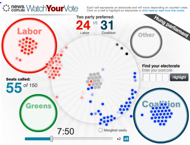
It was election night a few days ago in Australia, and News.com.au ran this graphic to show results in real-time during the election:
Instead of presenting the count as a map, we’ve made each electorate into a little ball, which pulses and swings and fights for position against 149 others.
As the votes come in, the balls spring to life, changing colour and moving towards the larger ball representing the party leading the vote. The colour will get deeper as the percentage of the vote counted rises.
At first it displays the primary vote, then when it’s time to call the seat for that party it switches to the two-party preferred or two-candidate preferred vote.
There’s also a scroll bar and a speed option so that you can go back and forth in time. Enter a postal code to highlight specific areas.
I lack the context to fully appreciate this, but several Aussies have sent me the link, so maybe someone can highlight some of the interesting points. It’s easy to see though how this could be fascinating during any election in your country or city, even if the floating animation is more for flash. A lot of the time we don’t care so much about the geography as we do the party splits and our particular area.
[Thanks, all]


The big thing about this is that its being driven by prediction models that News Limited are using to call each seat.
Hence as more votes come in (we use preferential voting for each lower house seat that represents a geographical area, and a more complex version in the upper house which is based on each state – you’re only looking at the lower house here), that model shifts between calling for an individual to unknown and back again.
It’s more indicative of how inaccurate some of the models are when the available information is low.