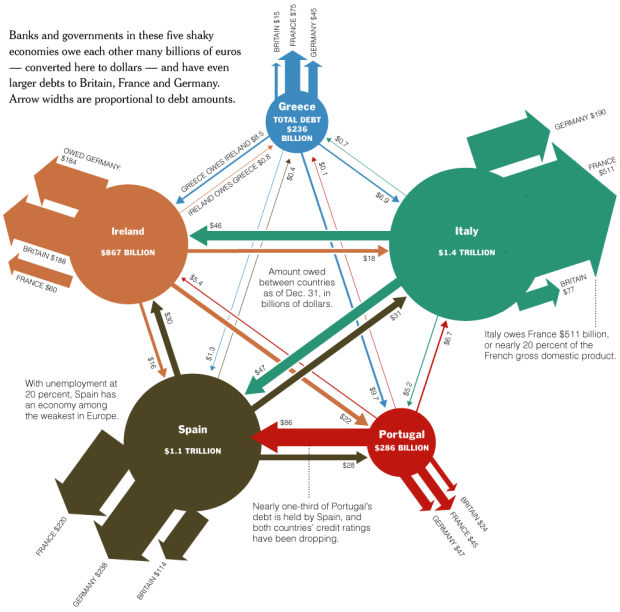
While the US has its own problems with debt somewhere in the range of $13 trillion, European countries have got some issues too. It seems like everyone owes something these days.
[Thanks, Tom]

While the US has its own problems with debt somewhere in the range of $13 trillion, European countries have got some issues too. It seems like everyone owes something these days.
[Thanks, Tom]
interesting graphic. would probably be more accurate to use the label ‘united kingdom’ rather than ‘britain’ however, as these terms are not synonymous. ‘britain’ is not inclusive of northern ireland, whereas the united kingdom is.
Quite complex reading, wonder what a “mekko” graph approach would reveal.
Interesting chart. In the details, I am a bit irritated by the use of both the circle area and the arrow width for the same dimension. I could imagine something along the lines of a radial Sankey chart (a la circos) to be interesting in comparison. Well done nevertheless.
JunkCharts took a look at this graphic, too, and decided to try to remake it, here. And, if I may be so crass as to put in a plug for myself, I tried a remake based on the JunkCharts remake. Mine is here
Gotta love that they’ve come up with a pentagram!
Pingback: Link(s): Tue, Jun 8th, 7pm | Your Revolution (The Blog!)
The figure for Ireland is I would say incorrect. Ireland hosts many banks, and the debts of these banks (many of them at the International Financial Services Centre in Dublin) have been included. If you take the debt figures as % of population this would mean that Ireland has debt per person of €217,000 (!).
Not that I’m saying Ireland doesn’t have debt problems though!
Gavin’s point is well made, I have gone to the trouble of correcting this graphic: http://www.ronanlyons.com/2010/05/11/untangling-europes-web-of-debt/
Everyone likes visualizations but that doesn’t mean journalists shouldn’t do their research beforehand.
Pingback: News That Matters – June 9, 2010 « News That Matters
Pingback: Broke Economies « So It's Come To This:
Pingback: Europe’s web of debt | edijason's blog
I wonder wether the new credit for greece is included in the graphic. I am from Germany, so its nice to know where all our taxes are gone…
The diagram is biased and provides a false impression: the debt of Germany is the biggest in Europe and it does not even appear in the graphic.
To whom does Germany owe its debt. Note that the graph only shows the debt owed between each other.
Exactly, but the title is “Europe’s web of debt”. There is the implicit suggestion that the countries that are shown have the largest debts, which is not true.
Reminds me to USS Enterprise star ships.