BBC Radio 1 takes a shot at displaying the top 40 chart visually in The Love 40. It’s actually a lot better than I thought it was going to be.
A grid view of bubbles arranges singles (or albums) such that you have each column as a day, and each row as a rank. So for example, the top right bubble, is the most recent number one single, which at the time of writing this, is Nothin’ on You by B.o.B, featuring Bruno Mars. Roll over any song (i.e. bubble) and a connecting path shows how the song has risen or fallen in the past few weeks.
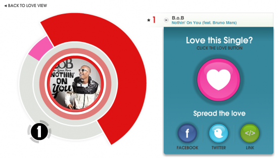
You can also choose to ‘love’ a song, which is like giving it a thumbs up. That in turn contributes to this not so worthwhile circle view thing, that I don’t really understand:

[Thanks, @liammcmurray]


The “love” view when you click a particular song/album seems be two different bar charts fitted radially around the centre circle. The first one (the pink bar against a grey bar) is the “Number of loves”, ie how many people have clicked “love this”. Not sure what the scale is.
The other half (the red segment in the image above) is a historical bar chart of the album’s chart position. So, if you click on a track/album that has a long chart history, you’ll see lots of different bars. The redder the hue, the higher the chart position.
One could go to town on criticising the viz techniques used in the love top 40, but that seems churlish – I think it’s pretty funky and as a 38yr old, Radio1 certainly aren’t trying to please me with this viz.
One thing I think they have got wrong is the inability to zoom in or out – I’d like to be able to see the full top 40 on one screen.
The chart view is not too dissimilar to Bumps Rowing race charts: http://www.mcshane.org/bumps/images/mays_men.png
All I see is a graphic image. Nothing interactive about it. What gives?
click the link in the post, and that’ll take you to the interactive.
Pingback: Extenuating Circumstances – links for 2010-06-04
Pingback: The Love 40: Charting the UK Top 40 Music Songs and Albums at thegraffik | Design and Illustration