As you know, there’s this big wave of transparency going on right now, and many organizations want to do more than just post a bunch of spreadsheets. They actually want to visualize it and share their data in a way that can be consumed by the general public. InstantAtlas aims to make that easy – without any code.
Mapping Focus
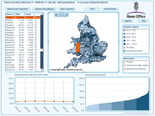
The focus is on online mapping and then building dashboards centered around that. For example, here’s one from the World Health Organization showing core health indicators (above). This one explores reported crime in London:

The dashboard is interactive, and because the views are linked, you can see several angles of the data at once. Now it’s no Stamen Design piece, but the interaction is pretty slick.
How it Works
The best part about this is the ease-of-use. With just a few clicks and a data import from Excel, you’ll get some files to copy to your server and your data is online in a few minutes.
Basically, via the step-by-step guide, you choose a template or customize your own for what type of map and graphs you want. You then select a map (.shp) file, and then import your data. Click on export, and InstantAtlas produces some Flash files for you copy over to your server.
I think it took me about 10 minutes to get something going after I was done installing.
Who it’s for
If your group has a lot of geographic data to share, and you don’t want to deal with hiring someone to build a custom app, then InstantAtlas might be a good fit. The data stays on your server, so you could also share just within your organization. In any case, InstantAtlas offers a free 30-day trial, so there really isn’t much anything to lose. Give it a try, and let us know what you think in the comments below.
Disclosure: InstantAtlas is a FlowingData sponsor.


All these tools are really great. I can’t argue with getting people more involved with their data, but it feels like something is being lost here, something about models and inference and actually deciding what the data mean. It is actually exactly Gelman’s April Fools post (“it’s not always such a great idea to produce smooth, reasonable-seeming maps from sparse, spotty data. As a political scientist, and as a statistician, I’d prefer being more honest about what the data are saying,”), where the InstantAtlas gets you close to the raw data but actually what you want is to see the data as your model of it sees it.
I haven’t used InstantAtlas, so stop me if I am mischaracterizing it.
(I can say the same thing about a lot of the “big data” movement these days. In a way it is just statistics as aggregates-of-numbers, not model building or inference, but that’s another rant for another time.)
i think that’s mostly a question of what visualization, in general, is used for and who should be involved with data analysis, right? it’s going to take a while for people to figure things out – for data literacy to improve – but we’ll get there eventually.
I guess one way to look at it: if people get more used to using this type of software and thinking about data, they’ll be more likely to want to learn statistics.
yes! exactly. it’s a great feeling when you make a graphic or interactive and the response is more questions and an interest in the data. “i wonder if…” or “what about…”
What is the price after free 30-day trial?
Jack,
You’ll find prices depend on the modules you decided to buy. The prices are posted on the instantAtlas website:
http://www.instantatlas.com/pricing.xhtml
Mark,
You raise a very valid issue. Poorly thought out presentations of statistics (or maps) are a root for bad analysis and poor conclusions. If reports are sensibly authored by qualified analysts or statisticians, the appeal of dashboards with multiple ways seeing the same data is to reduce misinterpretation. And where possible, it’s good for the author to have a place to add a qualified comment on what the data is and isn’t saying and its reliability. InstantAtlas provides the means for an author to really get the picture right.
For example by offering flexibility in choosing the default classification methodology most appropriate to the data distribution; a wide choice of graph options to fit the type of data and the ease of showing confidence limits in both the table and bar charts.
A good (and bad) example is this one from Germany.
http://www.loegd.nrw.de/gesundheitberichterstattung/nrw-kreisprofile/FP/atlas.html
This map presents infant mortality rates and viewed alone would suggest a clear clustering of the infant deaths in the North West. The default legend in this case is a 5-class quantile presentation. The picture could be exaggerated or understated, using other classifications. But in the end, you can play as you wish. The data doesn’t really tell any story. When you show the distribution of rates on a funnel plot in InstantAtlas, you can empirically show that most data points lie between the yellow (95% significance) lines. This suggests that there is insufficient sample size to draw any reliable conclusions!
Put in the capable hands of qualified analysts, the flexibility of these interactive dashboards can reduce the scope for misinterpretation of data compared to graphs and maps displayed on their own.
Pingback: tools for data visualizations « Geography 970
Pingback: Veille Technologique | Magazine de AlgerieNetwork
Pingback: Welcome to this month’s edition of the InstantAtlas E-Bulletin « InstantAtlas | data visualization tools for data professionals
Pingback: Herzlich willkommen zum monatlichen InstantAtlas Newsletter « InstantAtlas | visualisieren | kommunizieren| ENGAGIEREN
Pingback: Bienvenido al boletín mensual de InstantAtlas « InstantAtlas – visualizar, communicar, CAPTAR