Is the economy going to turn around any time soon? How does this economic swing compare to previous cycles? Amanda Cox et al of the New York Times explores these ever so important questions in her recent nine-part interactive series.
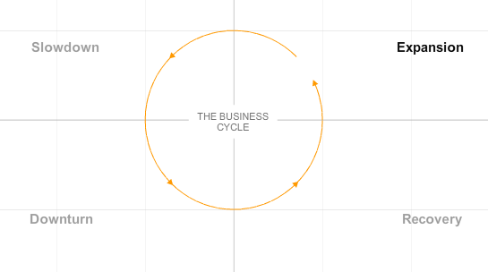
In a nutshell, the series is a story of business cycles starting at expansion, to slowdown, then downturn, to recovery, and we go in circles:

From there, we see the current cycle via industrial production in comparison to not just previous cycles (1969 to present), but also OECD leading indicators. It’s animated, it’s interactive, it’s sexy.
Go take a look for yourself. It’s pretty interesting once you take a couple of minutes to wrap your head around what you’re seeing. I’m thoroughly impressed, and I feel a little bit smarter, which is saying something, because I’m an economic buffoon.
What do you think – is this interactive totally awesome or is the material kind of over your head?
Other Versions
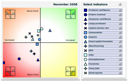
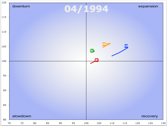
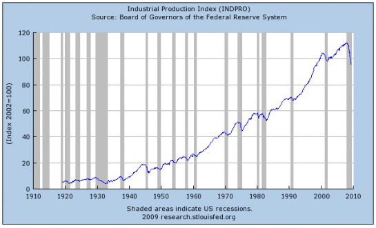
This of course is not the first time this data has been visualized. Here are three other versions. Two use a similar concept while the remaining uses an indexed time series. However, while similar, the goals of each are different.
This one is from the Bureau of Statistics in Netherlands:

This one form the OECD:

Finally, this is from the Federal Reserve Bank of St. Louis:

The NYT version plays out like a news story; the Netherlands and OECD ones are more like analysis tools with filters and more indicators; and the St. Louis fed uses a more traditional chart.
It’s pretty clear which is better aesthetically, but what about from a data perspective?


This is a really interesting graphic, and I spent a while studying it this weekend. One question I came away with was, suppose I had a random walk: what would the version of this graph look like? In other words, how much of that cycling is due to a genuine cyclic effect, and how much is due to the mathematical construction of the axes?
In any case, kudos to the Times for running a thought-provoking diagram.
I saw this one yesterday, and I have a question. What does it mean when the line is still in the downturn area but is moving upward? In the “perfect circle” the line reaches its bottom most point when it crosses over into recovery, but that’s not what happens with the actual day. Very curious about this.
Pingback: Is the Economy Getting Ready to Turn Around? (from Flowing Data) « Blog about Stats
Pingback: New York Times’ Take on Business Cycles « Tom Schenk Jr.
Amanda Cox is my new hero.
Notice that OECD considers the upper left hand quadrant a downturn compared to New York Times’ lower left quandrant. From a theoretical point of view, the lower left quadrant indicates a decline in the trailing 6-month industrial output and also overall declining output, so it should correlate with recession. However, the slowdown quadrant (as NYT defines it) has a higher correlation with recession than downturn.
Hi Nathan,
I’ve also implemented such a business cycle clock:
http://aktietwits.dk/makro-oekonomi/
It’s not completely as advanced as the others i see here though – but at least no flash – just plain images and javascript :-)
And a hint for those other developers out there – Eurostat/NL-bureau of statistics have made their code open-source (although very very messy code you can still get an idea):
http://forge.osor.eu/projects/bcc/
Thanks Nathan
Pingback: Recreating Another New York Times Chart | Modern Ui