 There’s a lot of crime data. For almost every reported crime, there’s a paper or digital record of it somewhere, which means hundreds of thousands of data points – number of thefts, break-ins, assaults, and homicides as well as where and when the incidents occurred.
With all this data it’s no surprise that the NYPD (and more recently, the LAPD) took a liking to COMPSTAT, an accountability management system driven by data.
While a lot of this crime data is kept confidential to respect people’s privacy, there’s still plenty of publicly available records. Here we take a look at twenty visualization examples that explore this data.
General Crime
Oakland Crimespotting. We’ll start with Stamen Design’s exploration tool. which uses data from CrimeReports. Pan and zoom the map and filter crimes by type (e.g. aggravated assault, murder). Use the time series chart to browse by day or use the brand new ‘time of day’ browser, which looks a lot like an old school cooking timer. Stamen’s Crimespotting is certainly one of the more elegant solutions of the bunch, especially with that new custom base map.
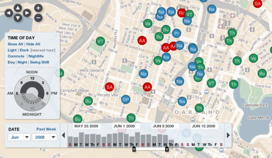
CrimeReports. This is where Crimespotting (above) gets its data from. It’s always interesting to see the same data displayed through different goggles. CrimeReports uses Google goggles (as do many others).
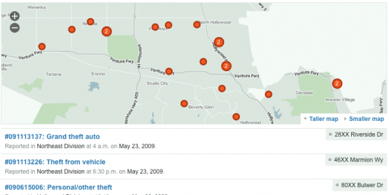
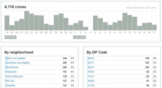
Everyblock. What started as ChicagoCrime.org, Everyblock reports on local crime (along with other events). Custom maps and interface-embedded graphs on Everyblock make for a smooth user experience and I believe serve as some of Stamen’s inspiration.
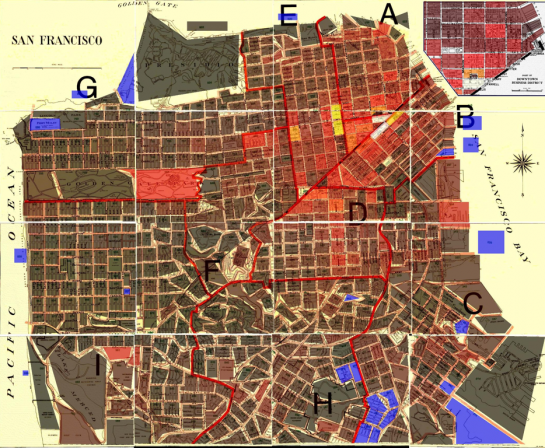
San Francisco crime map. This map is kind of dated (2003), but it’s nice to see old stuff sometimes. Here we see crime rate by block. Maybe this walkability map could be a good style idea for crime map 2.0.
Mount Fear. Abigail Reynolds uses police statistics for violent crimes between 2002 and 2003 in here data-driven sculpture. Higher peaks show more crime.

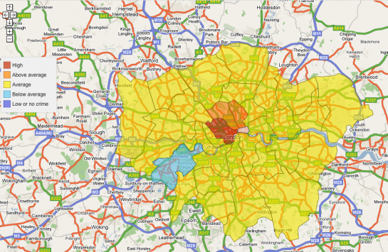
London crime mapping. From the Metropolitan Police in London is this thematic map that colors areas by level of crime. Red shows high and baby blue indicates below average. Click on regions for more details on the area.
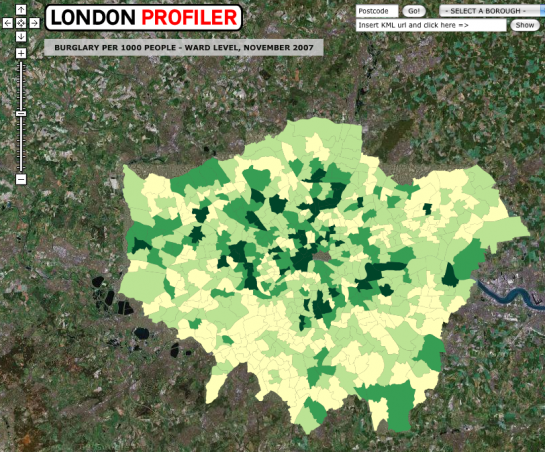
London Profiler. London seems to be a believer in crime maps. The London Profiler overlays burglary rates in November 2007.
Homicides
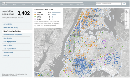
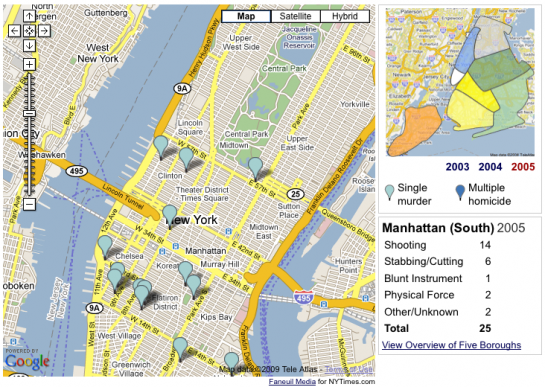
New York Homicides Map. The New York Times shows that even though you use the Google mapping API, your map doesn’t have to look Googley. Browse New York homicides by type, those involved, and by time. Roll over incidents to get more details about a crime.
Murder in New York. This old map from The New York Times was made back in 2006. It’s a straight-up Google mashup, and I put it here strictly for comparison. It’s fun to see how far NYT has come with interactive graphics on the Web, or maybe just all interactive graphics in general.
New York Daily Gun Deaths. Each bullet represents a death. Colors show the type of death i.e. suicide, homicide, accidental or legal police action. Counts are broken down by age group.

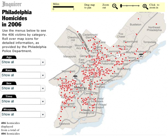
Murders map. The Philadelphia Enquirer with a map and filters to show homicides that occurred in Philadelphia during 2006.
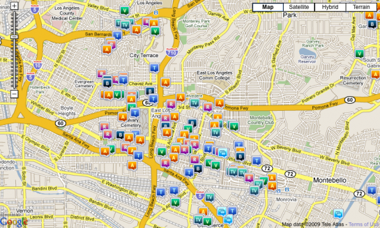
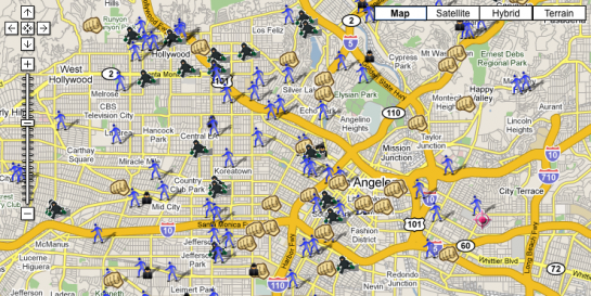
SpotCrime. Google Maps mashups are of course very popular. SpotCrime uses cutesy icons to show different types of crimes.
Criminals
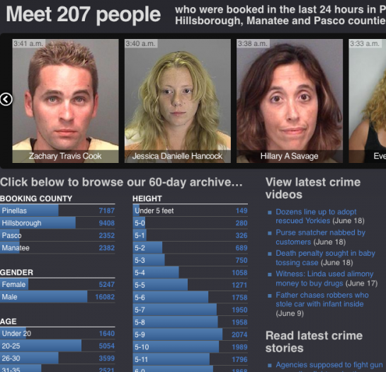
Tampa Bay Mugshots. Welcome to the wall of shame. Commit a crime and your mugshot just might end up on this wall too. Fingers crossed. Below the browseable mugshot slides are histograms of criminal demographics.
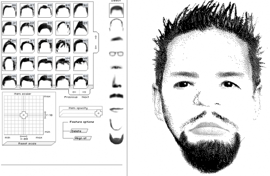
Flash Face. I had some fun with this one. Flash Face lets you become a sketch artist. Choose hair, head, eyebrows, and all the other details of the face to compose your own criminal sketch. Export and print to create a wanted poster of that neighbor you don’t like.
Victims
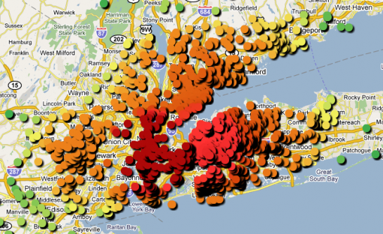
Bernie Madoff Victim Map. Bernie Madoff, the former non-executive chairman of the NASDAQ stock exchange. He screwed over a lot of people. This map shows the locations of the thousands of investors Madoff defrauded.
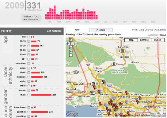
Los Angeles Times Homicide Map. This graphic from the LA Times provides a similar tool to that of previously mentioned NYT article. The top graph shows weekly toll counts in the Los Angeles area with interactive filters on the left. This map however focuses on the victims rather than the suspects. Click on a marker and get details about the person who was killed.
Police Department Activity
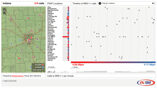
Emergency response. In another work by Stamen Design, this real-time activity display shows the activity in the INdigital Telecom emergency response system.
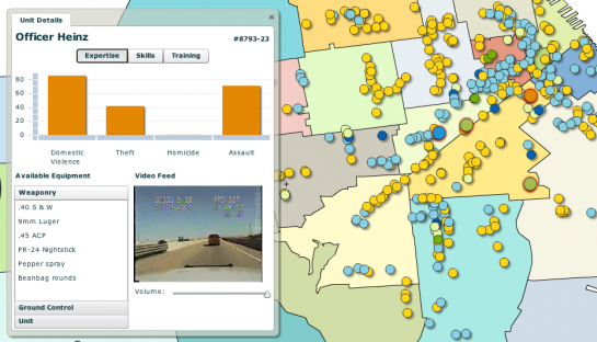
Incident Reporting and Analysis Tool. This prototype from Universal Mind is meant as a potential real-time display of police activity in San Francisco.
Government
Goverment scandals. Crime doesn’t have to be limited to homicides and theft. Slate Magazine uses an interactive venn diagram to show recent government scandals.
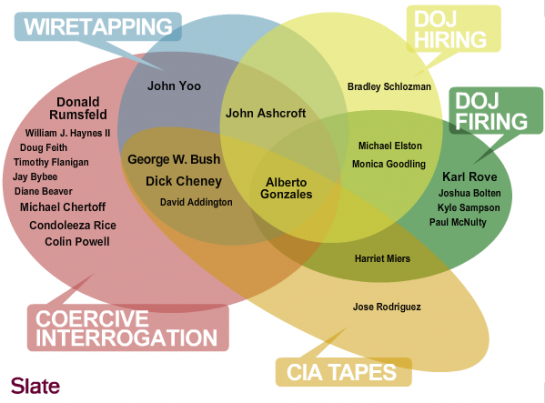
Illustrated Guide to GOP Scandals. Ah yes. The floating-head-on-cartoon-map style I believe is the technical term for it.

Are there any other visualizations that show crime in your area? Leave a link in the comments.

 Visualize This: The FlowingData Guide to Design, Visualization, and Statistics (2nd Edition)

There are more statistical maps of aggregated crime stats on http://www.instantatlas.com/crime.
The one we’ve worked on most is the Cornwall Crime Explorer at http://www.amethyst.gov.uk/crime.htm. This tries to adopt good practice in data visualization of aggregated statistics for a non-expert audience.
Crime levels and trends are mapped based on relatively well recognised administrative areas (wards) – even these present some issues around ‘low counts’ which plague many crime mapping applications rendering them pretty meaningless. In this case we are aggregating counts over 3 months to try and get counts higher. The data has significant seasonal variation which they wanted to capture.
Data is mapped by quintiles but with more easily understood categoric names using a widely used grading system (A-E). Map shades are recommended by ColorBrewer. Counts are published with rates, comparators are published alongside area specific figures. An indication of change over time, trend, is provided by comparing figures from the same time 12 months previously. A descriptive text box provides some context and a separate notes page gives a fuller explanation.
There is more detail on the case study PDF off the launch page.
Stumble Safely. Think your readers will love this site.
For some reason the link did not display. http://www.outsideindc.com/stumblesafely
You can read more about it here:
http://www.developmentseed.org/blog/2008/nov/12/stumble-safely-launched-drupal-fun-apps-democracy-late-entry
Pingback: 20 Visualizations to Understand Crime « Blog about Stats
Pingback: 20 Visualizations to Understand Crime | FlowingData « Netcrema - creme de la social news via digg + delicious + stumpleupon + reddit
Great post, and I’d like to point out the new Your Mapper, which also maps crime in Louisville and Cincinnati for now.
Some of the highlights include:
– a free robust API (in fact, the entire site was built using just the public API)
– the ability to embed the maps into your own website
– access to the maps on your mobile browser
– lots of data feeds for your searches including RSS, KML, CSV, Json, XML, and HTML
Louisville Crime:
http://www.yourmapper.com/map/e8306bb4ec177d952025e7dbbba585f7c74f8091/crime-reports/crime-in-metro-louisville-ky-since-jan-2003.htm?lat=38.249657&lon=-85.650017
Mobile:
http://www.yourmapper.com/m/index.php?address=st%20matthews,%20ky&id=e8306bb4ec177d952025e7dbbba585f7c74f8091&lat=38.249657&lon=-85.650017
Hi Nathan,
Thanks for the link! It’s worth pointing out that we don’t get our data from CrimeReports.com, though. Instead, the city directly provides us with an automated spreadsheet of report addresses and descriptions, which we collect and parse on a nightly basis.
I believe that other Oakland crime sites use this same data source, but CrimeReports.com does not. Instead, I believe they get their data in a more push-like form, which explains why their data is more up-to-date than any other. I believe the city also pays them for this privilege, viewing CR as a kind of software-as-a-service *for the police* rather than for citizens.
thanks, michal. i got my crime sites and sources mixed up. fixed.
Pingback: 20 Crime Data Visualizations « The Crime Map
Funny you should post this today (I am from the group who produce the London Profiler Site) – I was just blogging yesterday about the new crime surfaces on the Live Local site (http://local.uk.msn.com/) – see http://www.alex-singleton.com/?p=215 . Great summary post!
Pingback: links for 2009-06-23 | Semantic Internets
Pingback: Visualisations criminelles dans la presse en ligne | Benoît Drouillat
Stop tha crime ! Make your own smoothies!
Fruit flavor instead of using ya gun!
Awesome listing. CrimeReports has deals with local police to get data from their database. They get data directly from Buffalo Police http://bit.ly/1az3O7
This is a great inspiration for me to develop a charity site. I update you about the development soon. Best article..
Pingback: Dario Salvelli’s Blog » Blog Archive » Feedmastering #154
Pingback: links for 2009-06-24 « Donghai Ma
Pingback: LSDI : Venti mappe per ”capire” il crimine
Pingback: Four short links: 26 June 2009 | Tech-monkey.info Blogs
Pingback: Il ReteGiornale - la Tua Voce in Rete» Libertà d'informazione » Venti mappe per â€capire†il crimine
Pingback: Verlinkenswertes (KW 26/09) | Criminologia
Pingback: Visualising Crime « New Sciences of Protection:
Pingback: Ein Fall für CSI Rüttenscheid? - Beiträge - Community - DerWesten
Pingback: » EverydayUX morsels (June 25th – June 29th) | EverydayUX: Everyday User Experience by alex rainert
Pingback: Four short links: 26 June 2009 | ★ Technology News | Tech Crown
Pingback: Four short links: 26 June 2009 | ★ Technology News | Tech Crown
Pingback: “Happy Canada Day”
Pingback: links for 2009-07-06 « Ex Orbite
Pingback: A lire ailleurs du 22 juin au 9 juillet | traffic-internet.net
Pingback: 20 maneras de visualizar “la delincuencia” | Sicrono
Pingback: Visual Friday: Visuele criminelen - Spotlight Effect - carrièremagazine voor communicatietalent
Pingback: The Graphient Blog » Mapping Crime
Pingback: 20 visualizaciones de documentos para entender los crÃmenes [ENG]
Pingback: Weekly Blog Post « Kim's Converged Journalism Blog