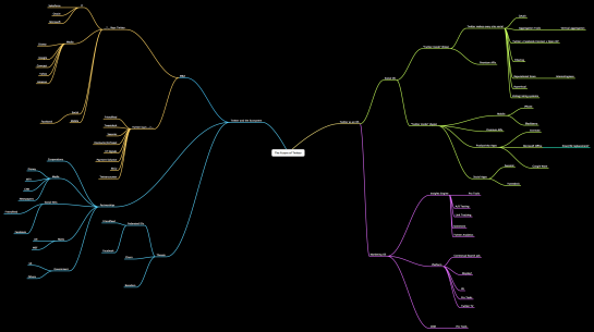
We all know Twitter has taken on a life of its own. With the very open API, Twitter allows developers to create countless applications on top of the service, and the sheer number of users has opened up opportunities in the area of real-time search. Needless to say, Twitter has a lot of opportunities worth considering, and it’s possible the service could look very different a year from now (underneath the frontend) as more people adopt and bubbling acquisition rumors perhaps come to fruition. The below flow chart from Steve Rubel shows Twitter’s possible future while the above from Brian Solis and Jess3 shows all the spawns of Twitter data.
[via TechCrunch]


One correction: the flow chart came from Steve Rubel from http://www.micropersuasion.com, who led an excellent and engaging brainstorming session at TWTRCON on Sunday. And Brian Solis’ Twitterverse was revealed at the Twitter 140tc conference earlier, and it was equally awesome, too.
Pingback: Possible futures of Twitter visualised | kitschbitch.com | katy lindemann
@Yama – thanks. fixed
Thanks for posting about this Nathan!
Would be much nicer if I could actually click on the first image and read the text.
@AK – you can. *hint* follow the link in post
Pingback: The Web2Marketer » Blog Archive » weekly (weekly)