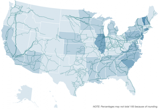
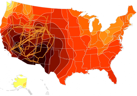
NPR provides an in depth view of the U.S. electric grid, exploring the network, power sources, and where in the country power is coming from:
The U.S. electric grid is a complex network of independently owned and operated power plants and transmission lines. Aging infrastructure, combined with a rise in domestic electricity consumption, has forced experts to critically examine the status and health of the nation’s electrical systems.
The above is a view of the grid; below is a view of nuclear and solar energy across the country.


The NPR team obviously put a lot of work into this interactive graphic. Explore data from eleven different data sources, apply filters, and view breakdowns for each state via a smooth interface. Really impressive work. Check it out for yourself.
[Thanks, Chris & Michael]


This has to be the definitive map of American energy. Alyson Hurt should win an award for this. Unbelievable detail and gorgeous layout.
Pingback: Links for 4/28
Pingback: Visualizing the power grid | Sugar Mob
What this visualization doesn’t show well, but that I’d like to see, is a bar graph of which methods generate power in each state, and perhaps another bar graph that projects what they hope to see in the future. The map would be useful, though, to show how much area would need to be covered with solar panels or windmills to provide the projected amount of power in those categories.
I have the feeling that there is a missing context. Canada and Mexico. Electricity is being sold/bought from Canada and Mexico and that would maybe influence the map a great deal.