The ever popular newsmap (above), a tree map view of Google News, got a facelift a few days weeks ago. Markos Wekamp, the creator, has changed to a rectangularized tree map layout to display headlines more completely, search as you type, and deep linking. Markos also brings the brightness down a notch from that of the original, which I like. It’s easier on the eyes.
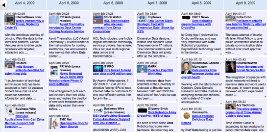
Earlier last week, Google released its own alternative news view with News Timeline. The interface lets you search the news, blogs, etc and results are displayed in a timeline format. Show by day, month, year, and decade.

The jury is still out on whether the timeline is an improvement over regular search listings. What do you think? How about versus the New York Times article skimmer?
[via infosthetics & Google News Blog & Newsmap Blog]


infosthetics claims the news timeline was inspired by google maps, but spatial navigation really doesn’t translate well to temporal navigation. I think taking cues from google finance’s temporal zooming would make the timeline much more usable.
I’m partial to Helvetireader javascript overlay for Google Reader.
Not really visualization in re: to charts and graphs of information, but it tends to minimize non-essential visual information in a pleasing manner.