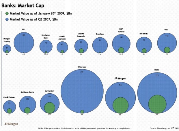
I know next to nothing about the economy, stocks, and investments, but I do know a little bit about charts and graphs. The above area circles were prepared by someone at JP Morgan. I don’t know, you might have heard of ’em. The circles are based on data from Bloomberg and meant to show the change in market value from 2007 to 2009. The problem here is that the creator sized circles by diameter instead of area, so the difference looks ginormous. I mean, the value change is significant but not that big.
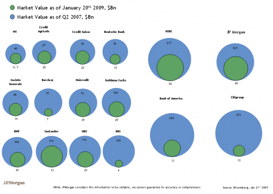
Here’s the revised version from a Big Picture reader, Rene Corda:
Now look at the original version again. Big difference, right?
Circles are 2-dimensional shapes. You can’t use them and expect people to compare two circles by diameter, a 1-D metric. Sorry, JP Morgan person. You fail.
Check out the Big Picture for some more graphs of the same data.
[via Cringely | Thanks, Barry]


The “fixed” chart is definitely an improvement in the sense that the areas are proportional to the values they represent, but circles aren’t a particularly good way to represent data in any case. (See: pie charts.) As suggested in a comment to this post ( http://blog.revolution-computing.com/2009/02/graphic-literacy-improving.html ) about the original chart, a simple dot chart would be a better way of looking at the data. You can see an example here: http://addictedtor.free.fr/graphiques/RGraphGallery.php?graph=150
“Circles are 2-dimensional shapes. You can’t use them and expect people to compare two circles by diameter, a 1-D metric.”
I like to maintain (mostly based on anecdotal evidence and hearsay, but at least occasionally from credible sources) that you can’t expect people to compare them on two dimensions, either, at least not very well. Might as well use something a little more 1-D. I think the bar graph alternatives in the Big Picture post are much more effective than circles for this kind of information.
Pingback: Attention aux graphiques dans vos reportings « Not Just BI
The problem, I think, stems from the technology. I wouldn’t be surprised if the creator of this graphic used an application like Illustrator to make it.
There is no easily-apparent way to make circles based on area in Illustrator, and if there is a way, hidden deep in those menus, I’d be very curious to know it.
What application do you use to create area-based circles?
To create area-based circles, use the SQRT() function in Excel to transform the data into its square root so that the relative areas of the circles come out correctly in Illustrator or something. For instance, if you’re trying to plot circles to represent values of 100, 289, 400, you can just set the circle diameters to 10, 17, and 20 so that the areas have the right proportions.
That’s incredibly helpful, thank you Charvak!
Pingback: What Once Was And Shall Never Be Again… « In One Ear… Out the Other
Pingback: Una gráfica con el valor de los bancos después de la crisis
I also think that circles (2D) were not convenient, so I decide to use a bar chart. I also doubt about using relative or absolute magnitude and I decide to use both.
In addition, I think that the data could be successfully represented with a table.
You can find my suggestions here:
http://www.ensilicio.com/2009/02/una-grafica-con-el-valor-de-los-bancos-despues-de-la-crisis.html
Regards.