There are so many ways that you can cut a dataset whether it be big or small. Cut it by time, different chunks of time, categories, etc., and you just might get a different story out of your graph. Over on Barry Ritholtz’ blog, The Big Picture, debate over the extent of job losses and this recession led to these four depictions of, well, job losses and recessions.
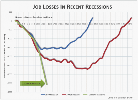
This first one is from Time Magazine, which shows job losses in recent recessions, and what got the discussion started.

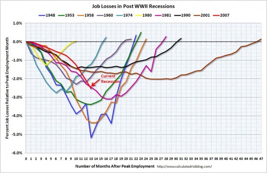
This one takes the natural next step and shows job losses is all post World War II recessions:

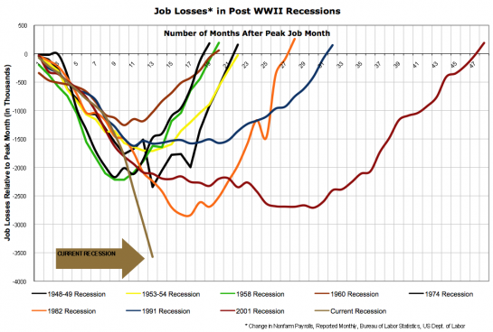
Now what if we look at the time it took to recover from job losses? Does that give us a better story?

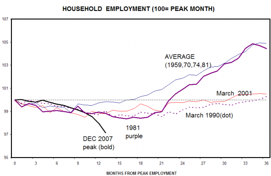
Lastly, here’s a look at the recession decrease in employment from the peak of NFP(?) per household:

I’m no economist, but it’s clear from the graphs that there is some serious job loss, and probably why Obama is so focused on creating and saving 4 million jobs. However, the severity of the current recession changes depending on what angle you point your camera. Which viewpoint do you think is right?
[Thanks, Barry]


This is interesting. I had studied the Time graph in last week’s issue. What I’d really like to see added to these displays is data that captures “Type of Job by Sector/Profession” That’s where I think we’d see more nuance.
It’s very misleading to show job losses in absolute terms, without correcting for population growth. The only graph that shows percent job losses has the current recession buried within eight other recessions.
Um, for someone who seems to do data analysis full time, you seem to have missed some startlingly obvious differences here — namely, the first charts are numerical job losses, and the latter are job losses as a percentage of the workforce. Since the workforce has grown rapidly since WWII, recent recessions are always going to look worse on total numerical job losses, so indexing them as a percentage of work force is pretty important. The first two charts, with no indexing and comparison to the two mildest recession of the 20th century, are incredibly trivial analyses created, I presume, to panic people into accepting whatever Washington gives them.
@coyote: Sometimes it’s better that I don’t include every detail of every graph when I post these things.
Luk is right. These charts are WORTHLESS. Any chart of this type must be relative to the size of the workforce at the time. At the end of WWII, US population was half what it is today. I’m surprised and very disappointed that you wasted a daily email on this.
The “This one” link for your second chart doesn’t link to a page about that chart, but about some other chart. I think you meant to link to this page — http://www.calculatedriskblog.com/2009/02/job-losses-during-recessons.html — which is a response to a version of that graph that showed absolute numbers rather than %
Like I implied in the comment to coyote, the fact that you guys are pointing out the problems in the graphs make this post completely worthwhile. I want readers to look at these graphs with a critical eye. I also encourage you to check out Barry’s blog where some very thorough discussion has developed.
@reed – thanks. i fixed the link. that’s what happens when i post too late in the night :)
wow.. what’s with the heavy handed negative comments? These were posted as something to consider. Clearly the commentor’s points are valid but the first graph was in TIME MAGAZINE so millions of people saw it and were influenced by it. Seems to me that alone is worth discussing… (and worthy of a post on a data visualization website)
I think this is the top layer of the onion. has there been a visualization of the type of jobs lost in these separate recessions. such as is this recession more broad across industries or has there a deeper impact in manufacturing, Tech, services. Also how have those job groups been impacted across history.
This was a very interesting post! I certainly agree that the absolute numbers are probably misleading in terms of showing the relative severity of the recession, and that the percentage-of-peak-employment adjusted graphs are more significant; but I think this was a great illustration of the job losses, and of what a significant difference percentage versus absolute scales can make. Thanks!
Indeed, this is an interesting post and very worthy of discussion; particularly among students.
The first graph (Time Magazine) was built using some nice design choices. The data ‘speak’ clearly and take figure (layer position, thick line thickness, hue, and shadows) and the structural elements relax into ground (thin line thickness, grey tone), although the grid is too dense in my opinion. The graph, by its design, looks authoritative. Obviously, as others have noted, the author plotted absolute values and not relative values (dependent variable) – thus making it very difficult for readers to make meaningful comparisons. Less critical readers will focus on the apparent severity of the current recession. Fear sells magazines.
The second graph does a better job for two reasons. It plots relative values (dependent variable) and expands the temporal domain (independent variable) to include events that still exist in the living memories among our older population groups. Yeah, there’s a lot of ‘ink’ wasted on the structural elements – but the reader can make meaningful comparisons (and more of them).
I lead students through several courses in Geography and Geographic Information Systems and all rely heavily on using and/or creating graphs or maps. I can and will use these two “different looks at job loss numbers” to show my students that context can tell lies just as persuasively as incorrect data can.
Thanks for the post, Nathan.
For real, enough with hating on this guy. In TFA, he says:
Over on Barry Ritholtz’ blog, The Big Picture, debate over the extent of job losses and this recession led to these four depictions of, well, job losses and recessions.
Suggesting there’s some disagreement as to the value of these depictions.
Pingback: But the Short Run Is Happening Now! « Matt Zeitlin: Impetuous Young Whippersnapper
I’m curious if these are numbers are based on total percentages or actual numbers. I would think that the population of the US has grown and what could look worse than previous years may be more in line than we think when based on percentages vs actual numbers.
That’s just from a graph stand point. From a people stand point, it’s obviously devastating regardless of how you look at it.
Pingback: xoxoANP! » links for 2009-02-14
Pingback: Going vertical. The wrong way. | dawaidawai.com
Pingback: Jobs losses: confronting recessions / Disoccupazione: recessioni a confronto « Zoescope
Pingback: The crash in words and pictures « take21
Pingback: The crash in words and pictures at take21.org/blog
Data on jobs come from the Bureau of Labor Statistics. Unemployment data are survey based because the notion itself is vague–just because someone is not on a payroll does not mean he is unemployed. The employment data are both survey based and payroll based (as a result of the requirement that businesses pay payroll taxes).
Nobody really knows how many jobs are being created or lost at any given time. Those data are a combination of surveys and the silly requirement that businesses of a certain size report layoffs and plant closings. A sophisticated look at unemployment requires consideration of employment, unemployment, duration of job search, possible regulatory changes that affect the numbers and skill level of the unemployed over time (for example, states that have an inflation adjusted minimum wage have really done a number on their low skilled people), and the benefit packages that are available to support the unemployed as it is quite clear that higher unemployment benefits makes people more likely to extend their employment search.
I applaud the comments showing concern with the quality of the data being graphed. One of the biggest problems in the public debate is that beautiful graphics often shill for thoroughly uninformative or ill-considered data.
Great graphs. Good work,
Pingback: Recession Job Losses Top Four Million « Blog of Intellectual Capital
“It’s very misleading to show job losses in absolute terms, without correcting for population growth. The only graph that shows percent job losses has the current recession buried within eight other recessions.”
Actually, if you look at the percentage chart, there are only three other recessions that had worse rates for the time period: 1948, 1953, and 1958.
Confession time … I used the “bad economy” as an excuse to fire some of my marginal staff. I hired replacements for half the pay, and they do twice the work of the staff I fired (and better) … I wonder how many employers are doing the same (FYI … our sale are up … by any measure … over the last year). I feel a bit guilty, but this recession has been a great excuse to “clean house.”
Pingback: NAGGEN.DE
Pingback: MarksterBlog » 4 Different Looks at Job Losses During Recessions
Pingback: Your Writing Dept Blog » InfoPorn: Presenting raw data with visually stimulating graphs
Pingback: Visualizing the economy and its effects « Visualization Blog