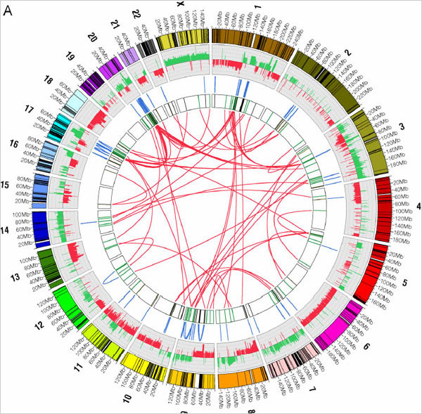
The thing about cancer cells is that they suck. Their DNA is all screwy. They’ve got chunks of DNA ripped out and reinserted into different places, which is just plain bad news for the cells in our body that play nice. You know, kind of like life. Researchers at the Baylor College of Medicine in Houston have compared the DNA of a certain type of breast cancer cell to a normal cell and mapped the differences (and similarities) with the above visualization.
The graphic summarizes their results. Round the outer ring are shown the 23 chromosomes of the human genome. The lines in blue, in the third ring, show internal rearrangements, in which a stretch of DNA has been moved from one site to another within the same chromosome. The red lines, in the bull’s eye, designate switches of DNA from one chromosome to another.
Some design would benefit the graphic so that your eyes don’t bounce around when you look at the technicolor genome but it’s interesting nevertheless.
Check out the Flare Visualization Toolkit or Circos if you’re interested in implementing a similar visualization with the above network technique.
[Thanks, Robert]

 Visualize This: The FlowingData Guide to Design, Visualization, and Statistics (2nd Edition)
Pingback: Caos cromosómico : Blogografia
Hi,
I just recently stumbled on your blog and just like this post, I’ve been finding it immensely cool and useful … I’m sure I’ll find the link to circos to be quite useful sometime in the future.
On a side note: I’m sure you’ve probably got xckd on your RSS feed, but today’s comic is, I think, particularly appropriate for you and your readers:
http://xkcd.com/523/
Happy holidays.
I’m working on a variant of the above display that would produce the same kind of graph but be interactive. Toolkit: processing.
Pingback: Visualizing cancer DNA scrambling — The Endeavour