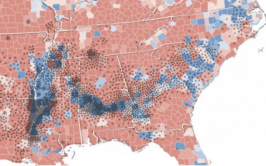
The U.S. election is over. The post-election analyses begin. The above map shows presidential voting at the county level. The more red a county is, the stronger the support for John McCain and similar for Barack Obama and blue. Below is cotton production in 1860. Each dot represent 2,000 bales. That’s some strong correlation. In fact, here is the election map with the cotton overlay:

This of course is a case of strong correlation – not causation. That is to say, if you get your county to grow more cotton, it doesn’t mean that you’re increasing the probability that voters will sway towards Democrat. As Strange Maps points out, it is in fact a correlation to African-American population (of which 91% voted for Obama). There has been some migration during the post-slavery area, but families have largely settled in the areas their families before them grew up in.
[via Strange Maps | Thanks, Albyn]


A great example of the difference between correlation and causality. This is a really important statistical and visualization concept. Very well illustrated with the above visualizations Albyn, Nathan
if you get your county to grow more cotton
Actually, it’s “if you can get your county to have grown more cotton 150 years ago…”
But if you could hop in your time machine and do that, it might work, since it would have changed the geographical distribution of slave labor then, and thus black voters now.
what a bizarrely racist analysis. and the ‘strangemaps’-site is even worse.
@gfb – Sorry if I offended you or anyone else for that matter. That wasn’t my intention with this post in the least bit.
Don’t be too quick to apologize. You have nothing to apologize for. Your analysis was not racist — you did not attribute motives and attitudes to people based on their race. All you did was point out facts. Black people (and white people!) had many policy-based reasons to vote for Obama. If race had not been a factor (for example, if half-white meant white instead of black), he would have won even bigger.
Also a great example of history and culture – 200 years later.
Pingback: contort.com - tighten up
You can see the same pattern in Google Maps too — just look at the satellite view of Alabama.
@Amos Newcombe: One of the fallacies that we all make with data, especially when data creates a correlation (or even a causation), is that we get to wash our hands of any inference and say “it’s just data!”
We live in a country and culture (like everyone in the world) with codes, signifiers, and symbols. Of course, these are open to interpretation; but I think a reasonable interpretation one can make from this visualization is a nice, euphemistic “poor, black people voted for Barack Obama.” I think this visualization is especially loaded, considering the sets of data are pulled from two different time periods not comparing the same thing. Cotton picking in 1860 vs. cotton picking in 2008? Helpful! But this one? Not so helpful.
Is it racist? Very possible that some would find it so and some would not. But don’t make the argument that data is data and it’s objective. That is simply unsophisticated thinking.
@Travis: Data inherits its objectivity from those who collect and present it. If that process is done honestly and with reasonable completeness, then yes, the data is objective, and can be considered fact — which is the word I actually used, for this exact reason.
In this particular case, cotton production in 2008 is irrelevant, thanks to slavery being ended and agriculture largely mechanized — it has no relevance to population distributions today. But cotton production in 1860 does, because poverty and hostility made it unlikely that southern ex-slaves and their families would redistribute themselves around the South. The ones that migrated, and there were many, left the South altogether, especially in the early 20th century as industry opened up jobs in the urban north, and destroyed jobs in the agricultural south.
It is this chain of reasoning that is being tested by the graph above, and while not perfect, the correlation is pretty good.
So where, in this analysis, is the racism, or the non-objectivity? Is it wrong to even ask questions about a group of people who identify themselves as belonging to a particular race? Is it wrong to look at a map of electoral results and wonder why?