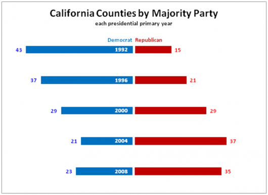
Last week I asked if you could improve a mediocre bar chart showing party majorities by county. There was a resounding yes as many of you deconstructed and then reconstructed your own graphs. For reference, here’s the original chart:
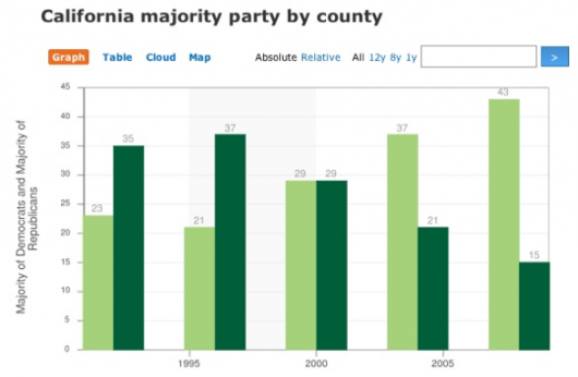
Here are the key flaws to the original that you all caught:
- The x-axis tick marks were in really weird places;
- The y-axis label was misleading because the data were number of counties;
- Red and blue would make more sense for Democrats and Republicans;
- Counts for counties don’t match the years, because they are reversed;
- We see a different story when we bring in data for undecided “other” and “declined to declare.”
What was the graph trying to show? It was trying to show party registration in California over the past five presidential elections. Did it succeed? No. It failed miserably; however, you did much better. Here are all the reworks.
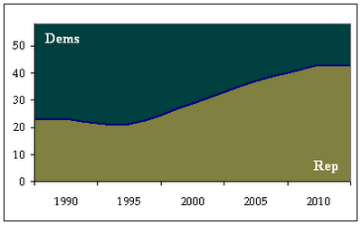
Brijesh made a stacked chart for Democrats and Republicans:
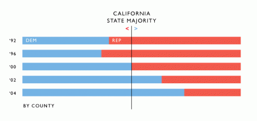
Tyler made a horizontal stacked bar chart with a useful majority line down the middle:
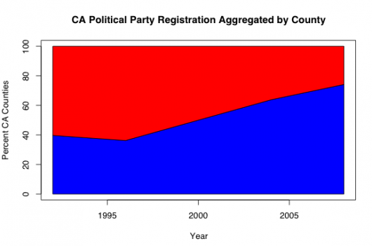
Blair provided some R code:
David used a tornado chart, which turned out well:
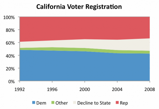
Amos went with a stacked line chart:
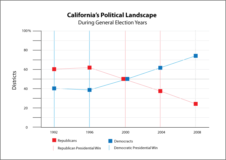
Kevin sent this one in:
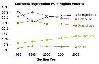
John put together a few versions – this being one of about five:
Jorge went with simplicity: ![]()
Stack created a time series for the Dems and Reps:
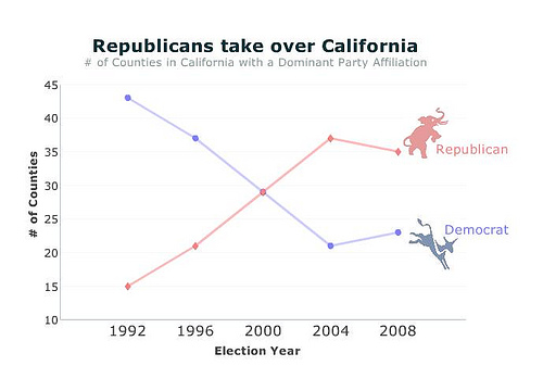
Jake put up a fan favorite:
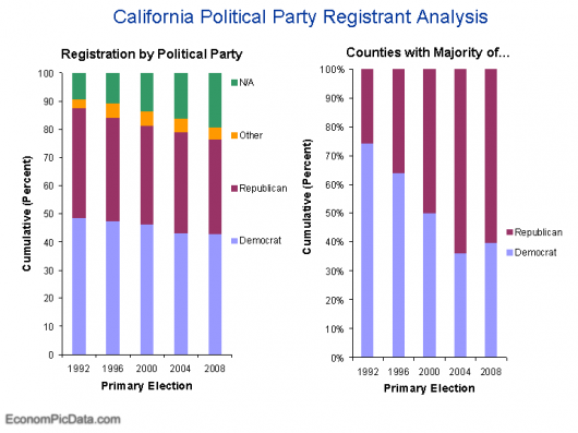
Nate, the graphic designer, embedded a stacked line chart inside the California boundaries:
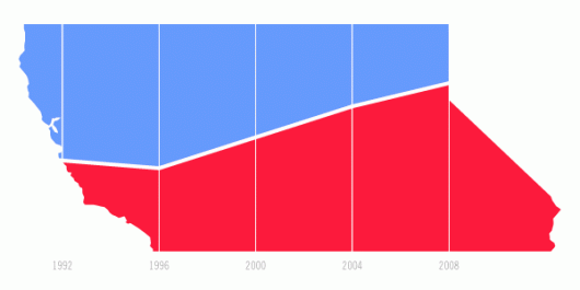
This is the one I made at the workshop:
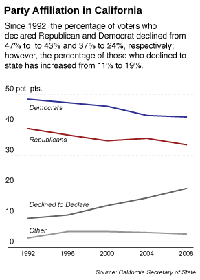
Personally, I like Jake and David’s the best, but who gets the golden star for best graph? I’ll let you be the judge.

 Visualize This: The FlowingData Guide to Design, Visualization, and Statistics (2nd Edition)

It’s obvious for me Tyler won. Amazing simple chart with the 50th percentile line. Although I haven’t never used to build such type chart for showing chronological changes in this case it looks clear.
Good competition Nathan
It’s obvious for me Tyler won. Amazing simple chart with the 50th percentile line. Although I haven’t never used to build such type chart for showing chronological changes in this case it looks clear.
Good competition Nathan
Seriously, I like yours the best. Seeing how “it was trying to show party registration in California over the past five presidential elections,” I think your line chart does the best at showing that. The charts that only show the Dem/GOP split suggest that there’s been a dramatic *rise* in Republican voters, which, as your chart shows well, wasn’t the case. (In fact, your header text helps draw attention to the fact that Republicans lost *three times as many* declared voters as the Democrats.
In terms of showing majority by county, I liked both Tyler’s and David’s. Although I like David’s tornado graph (thanks, BTW, for naming that … I’ve been playing with that format lately, but didn’t have a name for it), I think Tyler’s more clearly indicates which party has more counties affiliated with it.
Regardless, this was a fantastic exercise (I’m sorry I couldn’t contribute), and I’d love to see more exercises like this.
I think Tyler made a very clear and – also important – well designed bar chart. Not using the fluctuation but the absolute numbers per year makes it a lot clearer with the first glance.
I think Tyler made a very clear and – also important – well designed bar chart. Not using the fluctuation but the absolute numbers per year makes it a lot clearer with the first glance.
I think the county registration by party was a deceptive measure. Obviously there’s a significant mismatch in county population. Overall party registration statewide was declining, but the democratic plurality was never challenged. Among the charts of this deceptive measure, Tyler and David come first in a dead heat for me; Tyler’s 50% line is nice, but David’s chart indicates the balance more creatively. The area charts and line charts which do not show markers at the four-year points imply falsely that there was a continuous change between primary seasons.
The problem with Jake’s stacked columns is the only series with obvious trends are the top and bottom ones. It is not easy to see the decline in the statewide republican registration. My line chart is the only one which accounted for unregistered voters, though it’s not as polished as Nathan’s. Nathan’s line chart had no markers, however, and thus implied continuous data. I understand that markers are out of favor in line charts, but they convey useful information in addition to the actual values they represent.
Is it me or David’s chart shows years in wrong order on the chart?
Chandoo – I think you’re looking at the Democrats’ numbers of counties. The year is in white, reversed-out in the middle of each bar (the very right side of the blue bar).
I like Nate’s best. But I think Tyler deserves a hug, at least for not using Arial or Calibri, which is becoming the new Arial. But why did he save his work in GIF format?
@charlie… I figured it…
[quote]
Here are the key flaws to the original that you all caught:
1. The x-axis tick marks were in really weird places;
2. The y-axis label was misleading because the data were number of counties;
3. Red and blue would make more sense for Democrats and Republicans;
4. Counts for counties don’t match the years, because they are reversed;
5. We see a different story when we bring in data for undecided “other” and “declined to declare.”
[/quote]
looks like Nathan already pointed it in the top at flaw 4 – says the years were reversed in the original chart..
That these charts show different things depending on “county” or “voter” as the unit of comparison illustrates how the measure itself could be deceptive. Is “county” even a relevant unit for analysis?
How about a table?
It really depends on what you want to say with your graph. If you’re going to show that voters have become disenchanted with political parties, yours does by *far* the best job – it’s immediately obvious that both parties are losing to independent/decline to say.
If you want to pitch something to both parties without having to change your slides, pick Amos – neutral title, and by keeping “declined to say” in the middle, it’s easy to show a (potential) majority for either side.
Jorge’s is a great way to show that the state is “ready to turn”.
That’s a question that’s left out surprisingly often in the discussion of graphs – the intended message matters, a lot. There is no “pure data”.
Best advice I ever got at university was “If you’re creating a graph or a statistical analysis, know both what you want to say and the recipient wants to hear”.
Pingback: links for 2008-07-26 « test
For me it was Tyler first, and then David. Tyler by a nose because of his majority line but hmmmm…the proportional sizes of those bars in David’s efforts are pretty good.
Great effort all, and a very good exercise. Another one please!
Cheers,
Julian F
I think Tyler’s has a simplictic way of showing the relevant information. I also liked Kevin’s incorporation of the presidential winner into the mix.
Pingback: Excel Links of the week | Pointy Haired Dilbert - Chandoo.org
Pingback: Thinking about data visualization for journalists | Sixth W
Pingback: links for 2008-07-31 « Computer Learning Resources
Pingback: Links sobre charts de Excel « Optimización y EstadÃstica