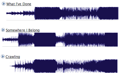
On Last.fm, someone took snapshots of some Linkin Park songs, compared them, and concluded that all Linkin Park songs look are the same. I guess at a glance, the songs might appear the same because of the dark chunk towards middle left, but it kind of stops there. Sure, there’s some loud to soft and soft to loud alternation, but who likes songs who are loud (or soft) throughout?
The beginning of the post:
Each image above shows the audio level in (roughly) the first 90 seconds of a Linkin Park song. The tempo has been adjusted for a few tracks for better visual alignment.
Wait a minute. The tempo was adjusted for better visual alignment? If you’re adjusting the tempo, then really, all songs can be made to look the same. On top of that, we don’t know the x-axis or y-axis units. Finally, there’s a lot more to a song other than dynamics — such as key, tempo, rhythm, and lyrics.
Another Look at the Music Data
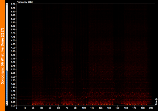
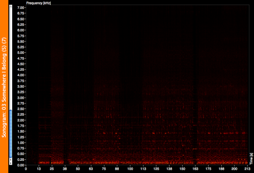
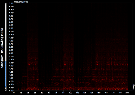
The skeptic that I am, I put the songs through AudioXplorer and created some sonograms for the songs in question.


The charts are on the same scale, and it’s a bit easier to see some differences (sorry the screenshots don’t have the greatest contrast). While What I’ve done and Crawling looked pretty similar in the first pictures, we can now see more differences like in dynamics and key. Secondly, as someone commented on Last.fm, “comparing all the songs that sounds similar, of course it’ll look similar.” I’m sure different results would show with different songs.
Anyways, my laptop needs to rest after AudioXplorer sucked out its life force for a bit too long. Just remember — you can use your data to prove a point, but don’t let your point change your data. Cheesy? Yes.

