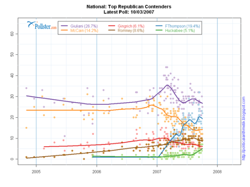
It almost feels like I see a new poll every day for who’s leading in the presidential race. There’s usually a good amount of fluctuation within a single poll with sampling margin of error and then of course the numbers vary across multiple polls. This can be confusing at times, so Pollster put all the results in one scatter plot. Then they stuck a smoother through all the points (for each candidate), and just like that, the viewer gets a general sense of how each candidate has been doing.
Keep in mind that the amount of noise (or bumps in the curve) is going to vary depending on the type of estimation you use, so I wouldn’t place the smaller curves under too much scrutiny. I’m not sure what method Pollster is using, but it’s interesting to see the overall trends. Could we be looking at a double New Yorker election?
Pollster also offers the raw poll data, so in case you want to have some of your own fun, there’s data waiting for you.
[via Mike Love]
 Visualize This: The FlowingData Guide to Design, Visualization, and Statistics (2nd Edition)