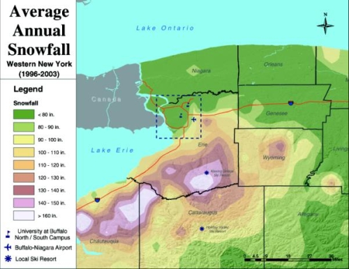
 I saw this map of the average snow levels in Buffalo. I think I just glanced at it and that was about it. When you first look at the map, what do you make of the colors? When I see green for snow levels, I think no snow. Am I crazy? What do you think?
So the image was kind of in my head all this summer while I was in NYC. When I told people that I was going back to Buffalo after my internship, they always gave this look that said, “Ha, have fun during the winter,” and then they would actually say it and then go into how they measure the snow level by comparing it against a giant pole.
Smart guy that I am, I thought to myself, “Can’t be that bad. The map that I saw on the University of Buffalo page showed the winter wasn’t really that bad.”
I went back to the map just now, preparing to compare Buffalo weather data to New York city data. I was going to prove once and for all that the Buffalo winters weren’t really that bad, and that people were just casting it in a bad light. It was going to be awesome.
Then I looked at the legend.

All of the colors represent 10-degree increments except for the extremes. Green represents average snowfall less than 80 inches. What? Darn. A quick look at the data shows that yes, Buffalo does get quite a bit more snow than NYC.
The lesson of the day: pick those colors carefully, because wrong colors just could be showing something that shouldn’t be shown.

