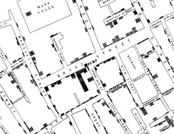
 If you’ve read any books on visualization, without a doubt, you’ve seen John Snow’s now famous cholera map. In 1854, people were dying in large numbers and high frequency, but nobody knew what was going on. John Snow solved the mystery with his map.
It’s crazy to imagine a time when people didn’t think to map data, especially now as mapping data has become second nature for some. Steven Johnson, author of Ghost Map, goes into depth on the Cholera outbreak in London in his book and TED talk earlier this year.
I’d embed it, but I can’t find the link anywhere on the TED page. They probably had to make it less obvious after Hans Rosling’s talk spread at the speed of Cholera in London in 1854. London hasn’t had another outbreak since Snow’s simple (for this day and age) but effective visualization.
UPDATE: Here’s Steven Johnson’s TED talk


Hi. 2 things:
1) you can embed this video from here:
2) any chance to see you on face book ?
Tal.
Thanks for the link, and yup, I’m on Facebook. You just have to know where to look.
Pingback: A Primer on Information and Data Visualization