Two more graphics — one ran on Sunday with a story investigating lifeguard competence and the other went yesterday with a story on religious books (or lack thereof) in prison libraries. Probably the most challenging part of both graphics was figuring out what to show; there wasn’t exactly a ton of data to choose from.
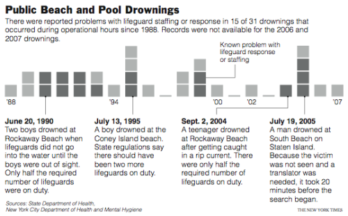
Less than Satisfactory Lifeguarding
I knew this was running on Sunday, but when I checked online, I didn’t see it. I was a little disappointed, because it kind of sucks to make a graphic and then find out it was grilled. Luckily, that hasn’t happened to me yet. Knock on wood. My lifeguard graphic wasn’t on the Web, but it was in the paper.

The graphic started as just small squares, but the results looked like they were missing something. It just looked like 32 tiny, shaded squares. They needed more context, so I highlighted incidents in which there were some serious lifeguard screw-ups. I think the excerpts make the graph a lot more human. What do you think?
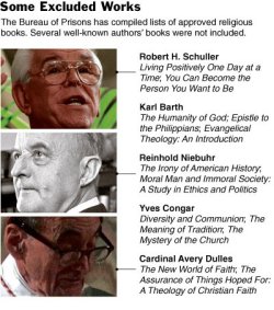
Religious Reading in Prison
 This one was purely informational. I was provided with a list of authors and books. They, um, as in the National news desk, not the universal “they,” also gave me a list of religions that the Bureau of Prisons had made allowed-lists for.
Are you confused? Yeah, I was too. To clarify, the Bureau of Prisons put together lists of allowed books for major religions.
From what I gleaned from the list, no major religions were left out. Not incredibly interesting, so I dumped that and was left with authors and their books. Hence the graphic. Voila.
Looks simple, yeah? Trust me, after eight weeks at The Times, I can think of about a million and four ways to crappy-fy the graphic. Oh yes, I’ve learned a lot, but oh yes, there’s still so much more for me to absorb these next two weeks.

