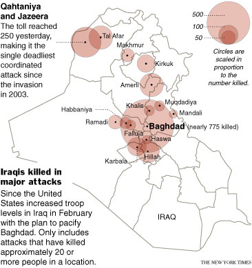
Two hundred and fifty people died a couple of days ago in the deadliest attack deadliest attack of the war. We compiled a list of the most deadly attacks since February and then mapped them out. It was a team (and by team, I mean two) effort — I collected the data and a co-worker mapped it out.
In this case, I went through old Times stories and took note of attacks that killed 20 or more people. It was really depressing reading all that stuff, but I’m definitely better for it. Without a doubt, I know more now than I ever have about what’s going on in the world.
As you can see, my co-worker went with the old bubble map standby. I wish we could show the data differently than the usual map, but what type of visualization would that be?

