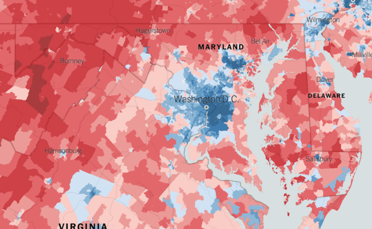
The Upshot returns to 2016 election results mapped at the precinct level. Because you know, we all want to experience the data as many times as we can before 2020.
There’s an interesting twist though. You can randomly view “one-sided places”, where the area voted mostly the same, and “voter islands”, where the area is surrounded by opposite-voting precincts. These are made more compelling by the granular data and ease of interaction, largely made possible by Mapbox.
There’s also a 3-D view in case you want to pretend you’re looking at an election game board.
 Visualize This: The FlowingData Guide to Design, Visualization, and Statistics (2nd Edition)