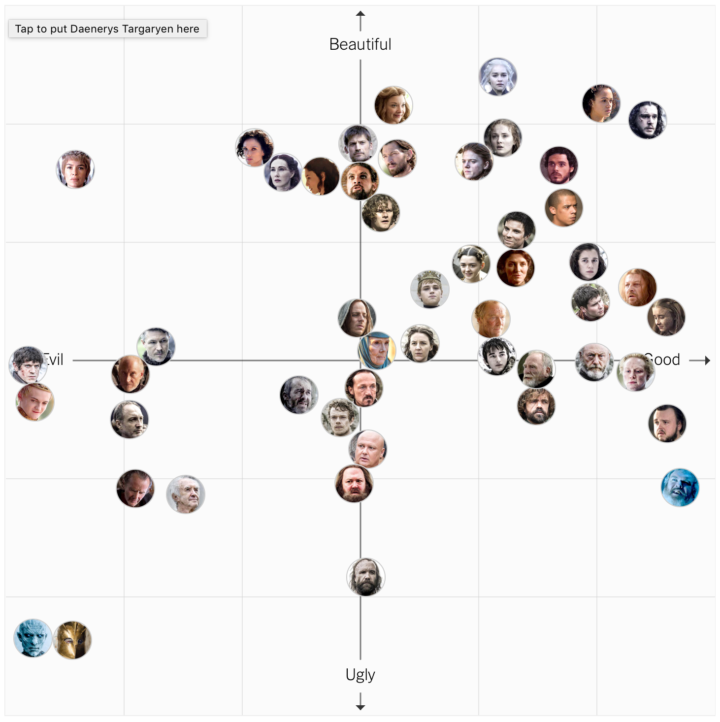
I’ve never seen this Game of Thrones show, but I suspect this will be relevant to many. The Upshot made an interactive that asks readers to place characters on a two-axis chart. The x-axis spans evil to good, and the y-axis spans ugly to beautiful. The result is the above, plus contour plots for each character’s place in the space.
Like I said, I don’t anything about the show, but I like the contour plots that have a split decision about beauty. For example, most people agree that Hodor is ugly, but there’s a small group who place him at max beauty. Similarly, Joffrey Baratheon and Ramsay Bolton are clearly evil, but they have wide distributions on the ugly to beautiful scale.
 Visualize This: The FlowingData Guide to Design, Visualization, and Statistics (2nd Edition)