Yeah, but what if you combine and overlay all these datasets? [xkcd]
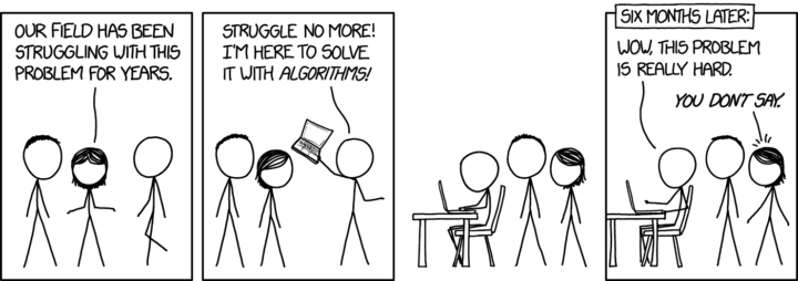
xkcd: Algorithms are hard
Second Edition
 Visualize This: The FlowingData Guide to Design, Visualization, and Statistics (2nd Edition)
 Visualize This: The FlowingData Guide to Design, Visualization, and Statistics (2nd Edition)
New tools, refined process.