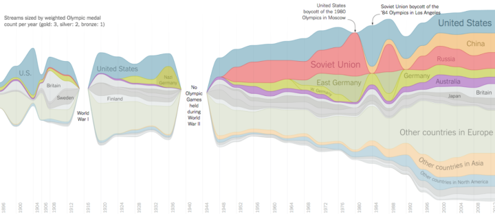
Gregor Aisch and Larry Buchanan for the New York Times visualized Olympic medal dominance with a streamgraph for each event. Time is on the horizontal axis, and each stack represents a country. The greater the height is at any point, the more medals the country won that year. Nice labels, too.
Streamgraph of Olympic medal wins
FlowingData Delivered to Your Inbox
Chart Type Used

Second Edition
 Visualize This: The FlowingData Guide to Design, Visualization, and Statistics (2nd Edition)
 Visualize This: The FlowingData Guide to Design, Visualization, and Statistics (2nd Edition)
New tools, refined process.