Poverty is on the rise. Justin Palmer mapped it for major cities in the United States.
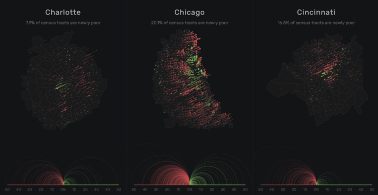
Concentrated poverty in the neighborhoods of the nation’s largest urban cores has exploded since the 1970s. The number of high poverty neighborhoods has tripled and the number of poor people in those neighborhoods has doubled according to a report released by City Observatory.
Instead of going with a choropleth map and filled polygons, Palmer went with sloped lines to show the change between 1970 and 2010. Longer lines mean greater absolute value, where red lines pointing up represent increased poverty and green lines pointed down represent decreased poverty.
I like it.
 Visualize This: The FlowingData Guide to Design, Visualization, and Statistics (2nd Edition)