I’ve been messing with horizon graphs to look at patterns over time. Software company Panopticon, now called Datawatch, devised them back in 2008, but you never see them used — probably because no one knows how to read them. The chart type is actually quite nice though, once you get the hang of it.
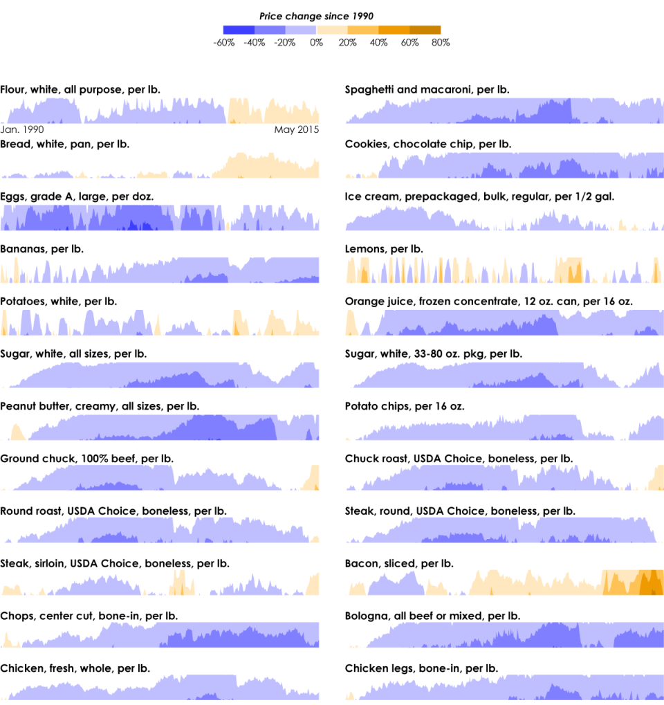
Below shows the percentage change in price for select food items, since 1990. Estimates are from the Bureau of Labor Statistics and adjusted for inflation (of course).

It kind of reads like a heatmap over time. Darker colors represent higher absolute values. But you also get the extra layer of information with the filled trend lines.
However, you have to start from the beginning to really understand what’s going on here.
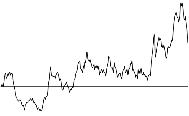
Start with a standard time series line. The one below shows the increasing price of bacon relative to the price in 1990. I removed axis labels and grid lines for the sake of simplicity.

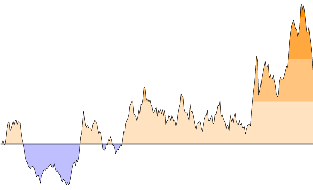
Now split the data up into bands using a uniform interval. Color based on how far above or below they are from the zero axis. Higher absolute values mean more intense shades of color, and a diverging color scheme is used to separate positive and negative values.

Now this is the tricky part. Collapse the positive bands to the zero axis so that the higher bands layer on top. Then reflect the negative values to the positive side of the axis, and collapse those in the same manner. The filled bacon time series chart becomes a horizon graph that takes up much less space and shows the same data.

With that in mind, go back to the first group of charts. It works quite nice as an overview visualization. The increasing price of bacon, flour, bread, and potatoes is easy to pick out at a glance. The seasonal price of lemons is obvious too.
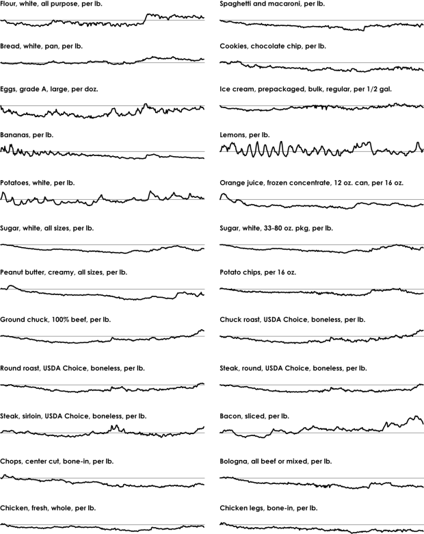
Here’s what the same data looks like if you used only lines.

You can still find the same patterns, but you have to look a bit closer to find them. For me, all the lines blur together until I refocus to look at an individual series.
How do the horizon graphs compare in terms of clarity? There’s some promise. The Berkeley Visualization Lab did some research a while back that suggests the same. I think it’s going to be a while though before the horizon graph becomes part of the general public’s visual vocabulary.


