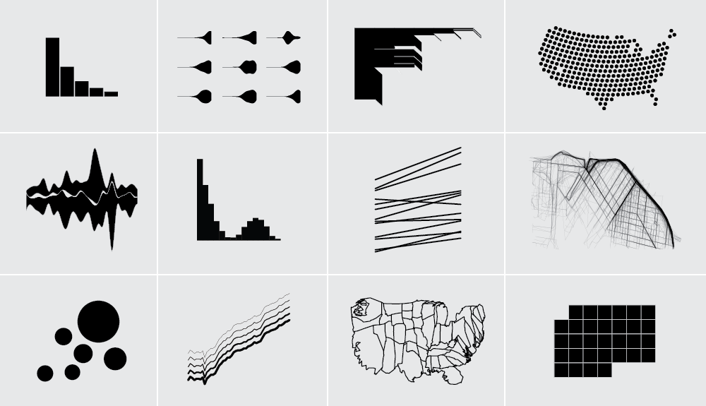
It’s the fourth year of running memberships on FlowingData (whoa). With at least one tutorial per month since the beginning, I’ve worked up a pretty good collection, mostly in R. Each tutorial is self-encapsulated. Download the source and follow the steps. You don’t have to work through other tutorials for one to be useful.
This is good if you already have a project in mind and want to put something together quick. It’s the recipe approach. Work through enough tutorials enough times, and you pick up patterns that you can apply to your own data.
However, if you’re new to R or coding in general, it can be a challenge to pick out the patterns. Where to start? What to learn next? There’s a benefit to more guided instruction. A course.
Members can access the Visualization in R course today.
The Course
The point of this course is to remove the guesswork and to guide you from beginner up to advanced.
I recommend a four-week schedule — 5 to 10 hours per week — but you can learn at your own pace. You start with the basics of R and then jump right into visualization. The focus of the course is all about the how.
You work through tutorials and pause to learn important concepts so that you can get into more advanced visualization. Exercises and suggested reading at the end of each week help you practice what you learn. By the end of the course, you will:
- Know how to work with real data
- Be able to explore data for analysis
- Create custom graphics fit for presentation
Here’s the weekly schedule:
Week 1
Get setup, learn the basics, and make charts in R with a few lines of code.
Week 2
Extend R by installing and working with packages and create custom charts to fit your needs.
Week 3
Spatial data. Map various data types and formats, and make geographic maps that look good.
Week 4
Refine what you learned the first three weeks with multi-faceted views, reusable code, and tools that are not R.
Not a member yet? Join now for instant access to the course and the full archive.