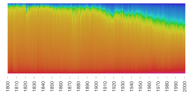
Martin Bellander saw some projects that extracted color from movie posters and trailers, and he grew curious about paintings. So he extracted and plotted the colors used in paintings over several centuries.
I decided to download images of paintings. So there is a bunch of different sites where you can access (photos of) paintings, e.g. BBC, Google Art Project, Wikiart, Wikimedia commons, and various museums. One of my favorites is the BBC:s site where you can browse through over 200K of well organized paintings! An amazing resource. For many of these there is also information on the year they were painted, the artist, etc.
So let’s use them to visualize the colors in paintings over history!
Notice the increased use of blue? Bellander still isn’t quite sure why that is, but he does a good job looking for possible answers. And bonus points for posting the R code he used to scrape images and analyze.


 Visualize This: The FlowingData Guide to Design, Visualization, and Statistics (2nd Edition)
