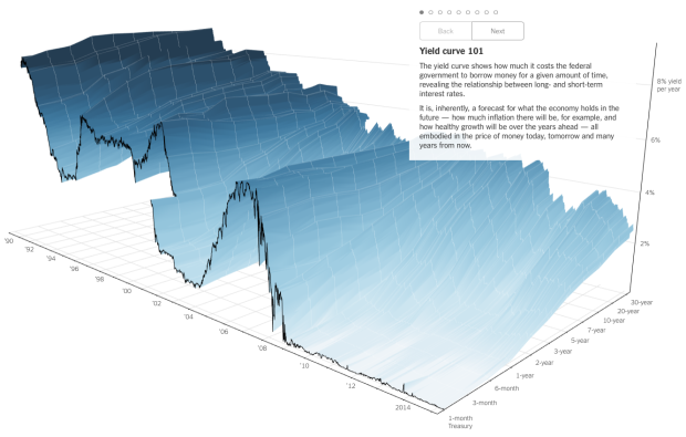
People like to poke fun at 3-D charts, mostly because they don’t work or a third dimension just isn’t needed. However, this chart by Gregor Aisch and Amanda Cox for the Upshot is a fine exception to the rule.
It is a yield curve that shows “how much it costs the federal government to borrow money for a given amount of time” which tends to be a good indicator for where the economy is headed. Time is shown on the horizontal axis, and percentage yield per year is shown in the vertical. The rates for 3-month, to 6-month, up to 30-year loans are shown in the depths of the chart.
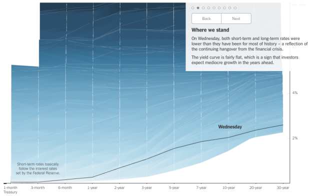
With just the initial view alone (shown above), I think the chart confuses many, but the tour of the data at different angles accompanied by explanations make it work. For example, the next step in the narrative transitions to a single timeline to see rates at the time of publication.
The smooth transitions at callouts at each step help keep you oriented. Plus, you can rotate the chart yourself by clicking and dragging.
 Visualize This: The FlowingData Guide to Design, Visualization, and Statistics (2nd Edition)