Andrew Van Dam and Renee Lightner for the Wall Street Journal provide a couple of useful linked views of unemployment and job gains and losses. The former comes as a grid where each cell represents the unemployment rate, and the standard time series is shown below that.
The second view is the more interesting part. It shows job gains and losses for various sectors (above), where each dot represents a sector and each column represents a year. Mouse over a sector to see how it did each year, and click on a year for a more detailed view like the breakdown below.
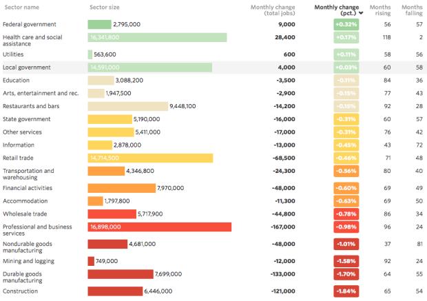
Or come at it from the other side and interact with the detailed view and see how it relates to the overview.
 Visualize This: The FlowingData Guide to Design, Visualization, and Statistics (2nd Edition)