One of the most annoying parts of downloading data from large portals is that you never quite know what you’re gonna get. It’s a box of chocolates. It’s government data sites. It’s lists of datasets with vague or unhelpful titles with links to download. Of course, I’d rather have a hodgepodge than nothing at all, but as with most things, there’s room for improvement.
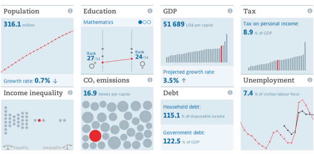
The OECD, which maintains and provides data on the country level, takes steps towards a more helpful portal that makes data grabs less of a headache. With the help of Raureif, 9elements, and Moritz Stefaner, the new portal is still in beta, but there’s plenty to like.
A chart or map accompanies each dataset, so that you can quickly gain a sense of what’s there. Interested in looking at the data on your own computer? There’s a convenient and obvious button to download the data.
You can also embed the charts on your site if that’s your thing:
The charts load quickly and are responsive, meaning they work on various devices that are not your computer. Even the small charts are interactive.
Good stuff. Take a look.
See also the World Bank data browser which went the visual route in 2010. Although, I don’t think it’s been updated much since.


