For a graduate project, Michael Barry and Brian Card explored the Boston subway system through a set of annotated interactives that show train routes, usage, and scheduling.
Through publicly available data, we have the tools to understand the subway system better than we ever have before. We have seen how the system operates on a daily basis, how people use the system, how that affects the trains and also how this ties back to your daily commute. To see a real-time version of this data, check out mbta.meteor.com for up-to-the-minute congestion and delay information.
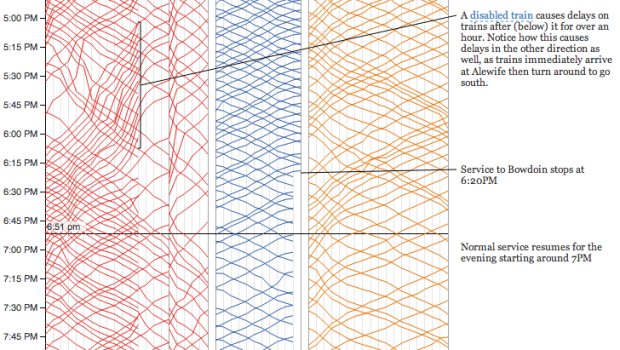
I like how they keep a subway map in view throughout. It helps you efficiently figure out what each chart means and is a good common factor as you move through the facets.
 Visualize This: The FlowingData Guide to Design, Visualization, and Statistics (2nd Edition)