How to Make Government Data Sites Better

Accessing government data from the source is frustrating. If you’ve done it, or at least tried to, you know the pain that is oddly formatted files, search that doesn’t work, and annotation that tells you nothing about the data in front of you.
The most frustrating part of the process is knowing how useful the data could be if only it were shared more simply. Unfortunately, ease-of-use is rarely the case, and we spend more time formatting and inspecting the data than we do actually putting it to use. Shouldn’t it be the other way around?
It’s this painstaking process that draws so much ire. It’s hard not to complain.
Maybe the people in charged of these sites just don’t know what’s going on. Or maybe they’re so overwhelmed by suck that they don’t know where to start. Or they’re unknowingly infected by the that-is-how-we’ve-always-done-it bug.
Whatever it may be, I need to think out loud about how to improve these sites. Empty complaints don’t help.
I use the Centers for Disease Control and Prevention as the test subject, but most of the things covered should easily generalize to other government sites (and non-government ones too). And I choose CDC not because they’re the worst but because they publish a lot of data that is of immediate and direct use to the general public.
I approach this from the point of view of someone who uses government data, beyond pulling a single data point from a spreadsheet. I’m also going to put on my Captain Obvious hat, because what seems obvious to some is apparently a black box to others.
Provide a useable data format
Sometimes it feels like government data is available in every format except the one that data users want. The worst one was when I downloaded a 2gb file, and upon unzipping it, I discovered it was a EXE file.
Data in PDF format is a kick in the face for people looking for CSV files. There might be ways to get the data out from PDFs, but it’s still a pain when you have more than a handful of files.
For example, the data and statistics page for sexually transmitted diseases on CDC points to a bunch of PDF files.
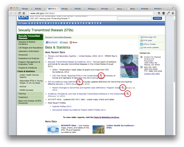
Uh oh, it looks like the page might have caught something.
So to use the data, you must download PDF files and scroll through the pages to find the actual data tables.
Excel spreadsheets is the other most common format. It’s better than PDF, but you still have to convert, and there’s almost always a bunch of other cruft in the spreadsheet that you have to remove before you can export to CSV.
Some release data in SAS format. Users who don’t have SAS are screwed. Same with Microsoft Access. Again, there are ways to convert these files to CSV, but it’s so much easier to import CSV into other programs than the other way around.
Just give us CSV files. Everybody wins.
Useable data format is the most important, and if there’s just one thing you change, make it this.
(Raw data is fine too)
It’s rare to find raw government data, so it’s like striking gold when it actually happens. I realize you run into issues with data privacy, quality, missing data, etc. For these data sources, I appreciate the estimates with standard errors. However, the less aggregated (the more raw) you can provide, the better.
CSV for that too, please.
Never mind the fancy sharing tools
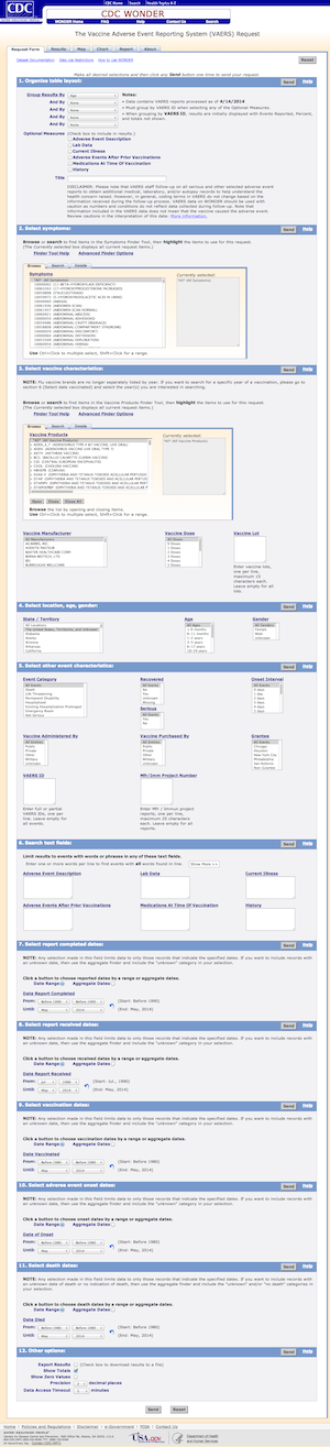 Not all government data is wedged into PDF files, and some of it is accessible via export tools that let you subset and layout your data exactly how you want it. The problem is that in an effort to please everyone, you end up with a tool shown on the left.
That is a long form.
You might not even get data after you select all of your options.
The multipart form is from the CDC’s WONDER, which stands for Wide-ranging Online Data for Epidemiologic Research. I think government organizations are required by law to give every single project an acronym that evokes a feeling of magic.
There are various problems with the form, but the worst is that you almost always have to know exactly what you’re looking for. You have to know the name that the CDC used for that specific report. If you don’t, you have to browse through a lot of options. Some options might make zero sense.
Financially, these forms (and the databases behind them) don’t make a lot of sense either. I don’t know what the situation is with CDC WONDER (ALL CAPS), but I know some government organizations have to pay contractors substantial sums of money to make changes or add and remove data.
It’s okay to remove some of the options. Let people subset and format the data on their own. Just provide the data that allows that.
Annotate and include metadata
WONDER is one of several data portals the CDC provides. Another is at data.cdc.gov. The main data that it houses is from the National Notifiable Disease Surveillance System (NNDSS), which is published weekly in the Morbidity and Mortality Weekly Report (MMWR). Yay for abbreviations.
The CDC data subdomain makes use of the Socrata Open Data API, which sounded fun at first. It’s weekly data that has been updated regularly for the past few months. There’s an RSS feed. There’s an API. There’s a lot to like.
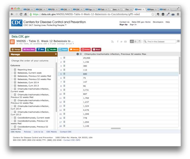
There’s also a lot of variables without much annotation or metadata.
For example, Coccidioidomycosis, commonly known as “valley fever”, is one of the semi-weekly reported conditions. When I checked one of the weekly reports, the count for California was in single digits, and there were several east coast states in double digits. I should also mention that another name for Coccidioidomycosis is “California fever”.
This is likely related to who reported during the week. The counts for all the NNDSS conditions vary based on who reported to the system, so one week a count might be zero and it might be triple digits the next. There’s no way to see who’s reporting though, which makes it difficult to compare states or look at changes over time. You can’t really take much away from a single data point either.
I emailed the “Dataset Owner” about the low counts last month. I didn’t get an answer.
I’m almost certain that the reporting sites information is available on some PDF, but we shouldn’t have to sleuth for it.
When you share data, tell people where the data is from, the methodology behind it, and how we should interpret it. At the very least, include a link to a report in the vicinity of the dataset.

Tell people where to get the data
Get the things above done, and your government data site is exponentially better than it was before, but let’s keep going.
The navigation process to get to a dataset is incredibly convoluted, which makes it hard to find data and difficult to return to it.
The start page of for CDC data and statistics doesn’t seem too bad at first glance. We get a list of topics and links to tools on the bottom.
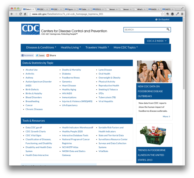
However, we run in to two immediate problems. (Disregard the choice of stock photo of three teenage girls eating strudel, above the headline of foodborne disease outbreaks.)
The first is under the Tools & and Resources section. It’s a mix of vague descriptions like “interactive data tools” and “state and territorial data” and titles that don’t mean much to the uninitiated like “CDC Vital Signs”, “NCHHSTP Atlas”, and “VitalStats”.
Which one do we choose to get the data we want?
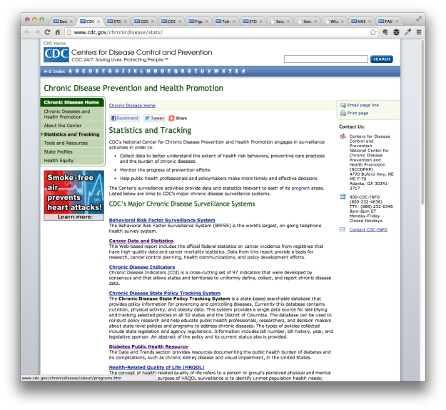
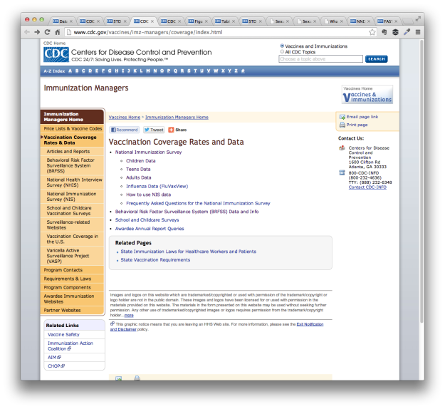
I guess it’s better to go through the topic pages. But there isn’t much consistency across the pages, so we’re always sleuthing.
For example, the page for chronic diseases is purely a list of more resources.
The vaccinations page goes directly to subpopulations.
If someone’s looking into a specific topic, this isn’t too bad. They’re unlikely to visit other topic pages anyway. However, problems arise when you change the links on the topic homepage. If we didn’t bookmark a data source of interest, it’s almost guaranteed we spend an hour looking for it again. So frustrating.
Consistency across topic pages can at least help us figure out where to turn when we lose a URL.
Mainly though, I don’t want to spend half a day looking for data. Anything you can do to expedite the process is much appreciated.
Consistency
Speaking of which, a challenge of big government organizations is that they employ a lot of people who tend to work independently of each other. The CDC employs 15,000 people and the CDC data and statistics sections look like it. I wish it wasn’t like this, but I understand why it is like this.
The pain comes when the inconsistency carries over to the data you provide and how you provide it.
Some data is provided via a portal, such as the previously mentioned WONDER and Data.CDC. Others only provide PDF files, whereas others go with Excel, CSV, or formatted plain text.
The CDC data search seems to get worse when I start to use Google to find the data I want. I end up on a separate site like HealthData.gov, which provides the same meta-information as the CDC sources, and the site simply points back to CDC.
Choose a format or framework. Make a decision. Get people in your organization to use it.
Show visual previews
I’m all for visualization integrated with the data search tools. It always sucks when I spend time formatting data only to find that it wasn’t worth my time. Census Reporter is a fine example of how this might work.
That said, visual tools plus an upgrade to the previously mentioned things is a big undertaking, especially if you’re going to do it right. So I’m perfectly fine if you skip this step to focus your resources on data that’s easier to use and download. Leave the visualizing and analysis to us.
Decide what’s important, archive the rest
So much cruft. So many old documents. Broken links. Create an archive and highlight what people come to your site for.
Wrapping up
There’s plenty more stuff to update, especially once you start to work with the details, but this should be a good place to start. It’s a lot easier to point out what you can do to improve government data sharing than it is to actually do it of course. There are so many people, policies, and oh yes, politics, that it can be hard to change.
Maybe give it a try anyway.
Seek out the people who care.
Maybe start with an area you are already strong, improve on it, and branch from there. In the case of CDC, a start with WONDER or Data.CDC might be where it’s at. Or maybe start by unifying the topic pages and all those spreadsheets.
As an outsider looking in, I can’t say for sure the best place to start. I don’t know all the administrative baggage that comes with updating these sites. I would just hate to come back to this five years from now and see that nothing changed or worsened because of age.
Like I said, I want to use government data. Lots of people do. At this point though, it’s just hard not to complain.
Become a member. Support an independent site. Get extra visualization goodness.
See What You Get