This year’s polar vortex churned up some global warming skeptics, but as we know, it’s more useful to look at trends over significant spans of time than isolated events. And, when you do look at a trend, it’s useful to have a proper baseline to compare against.
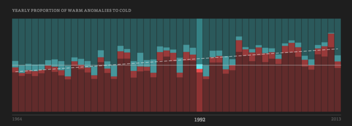
To this end, Enigma.io compared warm weather anomalies against cold weather anomalies, from 1964 to 2013. That is, they counted the number of days per year that were warmer than expected and the days it was colder than expected.
An animated map leads the post, but the meat is in the time series. There’s a clear trend towards more warm.
Since 1964, the proportion of warm and strong warm anomalies has risen from about 42% of the total to almost 67% of the total – an average increase of 0.5% per year. This trend, fitted with a generalized linear model, accounts for 40% of the year-to-year variation in warm versus cold anomalies, and is highly significant with a p-value approaching 0.0. Though we remain cautious about making predictions based on this model, it suggests that this yearly proportion of warm anomalies will regularly fall above 70% in the 2030’s.
Explore in full or download the data and analyze yourself. Nice work. [Thanks, Dan]
 Visualize This: The FlowingData Guide to Design, Visualization, and Statistics (2nd Edition)