Last year, URL shortening service bitly and Forbes made a map that showed popular news sources by state. However, the map was based on a static month of data, so what it showed then doesn’t necessarily apply to now. Bitly took it a step further this year and shows media consumption in real-time.
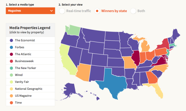
They also categorized media sources into newspapers, tv and radio, magazines, and online only for a more detailed view. And to top it off, you can click on states to see a list of top sources, and you can see links driving traffic to the listed sites.
One key thing to keep in mind as you read the maps: They show disproportionality rather than raw counts. So when you see that Texas is a TMZ fiend, that doesn’t mean they click more on the celebrity news site more than on Huffington Post. Rather, it means the relative volume of TMZ-clicking from Texas versus other states is higher versus the relative volume of Huffington Post-clicking.
 Visualize This: The FlowingData Guide to Design, Visualization, and Statistics (2nd Edition)