Shan Carter and Kevin Quealy for The New York Times updated their housing prices graphic from a couple of years ago.
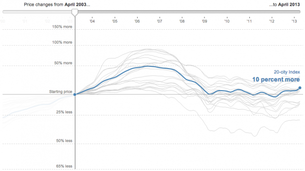
Whereas the original interactive showed price changes from only one point of reference, the updated one lets you shift the point of reference so you can see how prices have shifted in major cities since the date of sale.
I found myself brushing the slider back and forth just for kicks.
 Visualize This: The FlowingData Guide to Design, Visualization, and Statistics (2nd Edition)