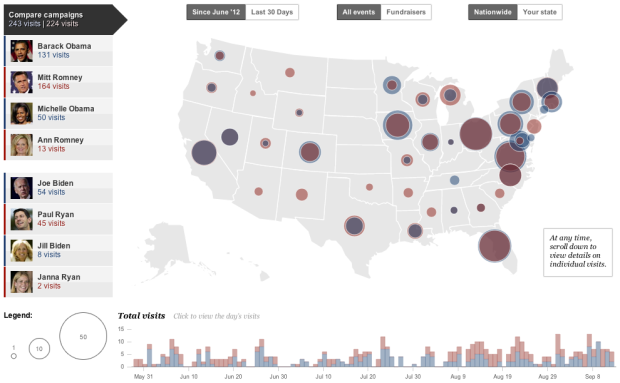
Emily Chow, Ted Mellnik, and Karen Yourish for The Washington Post mapped where the candidates and their wives have visited since June in an interactive with filters and multiple views.
On load, you see the visits of the eight, with a comparison between Democrats and Republicans. The map on top shows where, and the time series on the bottom shown when. Click on the map, and it zooms to show visits at city-level, and a click on a time slice updates a list of individual visits. Furthermore, you can select the individuals or categories for just the last 30 days, fundraisers, or your state.
The interaction lets you narrow down quickly and easily to what you care about. The only other thing I would’ve liked to see is a tighter coupling between the time series and the map.
 Visualize This: The FlowingData Guide to Design, Visualization, and Statistics (2nd Edition)
It’s a nice visualization, but one problem that immediately stuck out to me was that the concentric circles aren’t a good way to see the comparison between Dems/Republicans. Even with the shading (the blue is redder with red behind it and red is more blue with blue behind it) it only works when there’s a big discrepancy between the two. When the numbers are very close, it gives the completely wrong idea. For example, at first glance, I would think that California was all Democrats and Florida was all Republicans, when in fact in both cases the numbers were very close. And in fact there were more Republicans in California and Democrats in Florida.