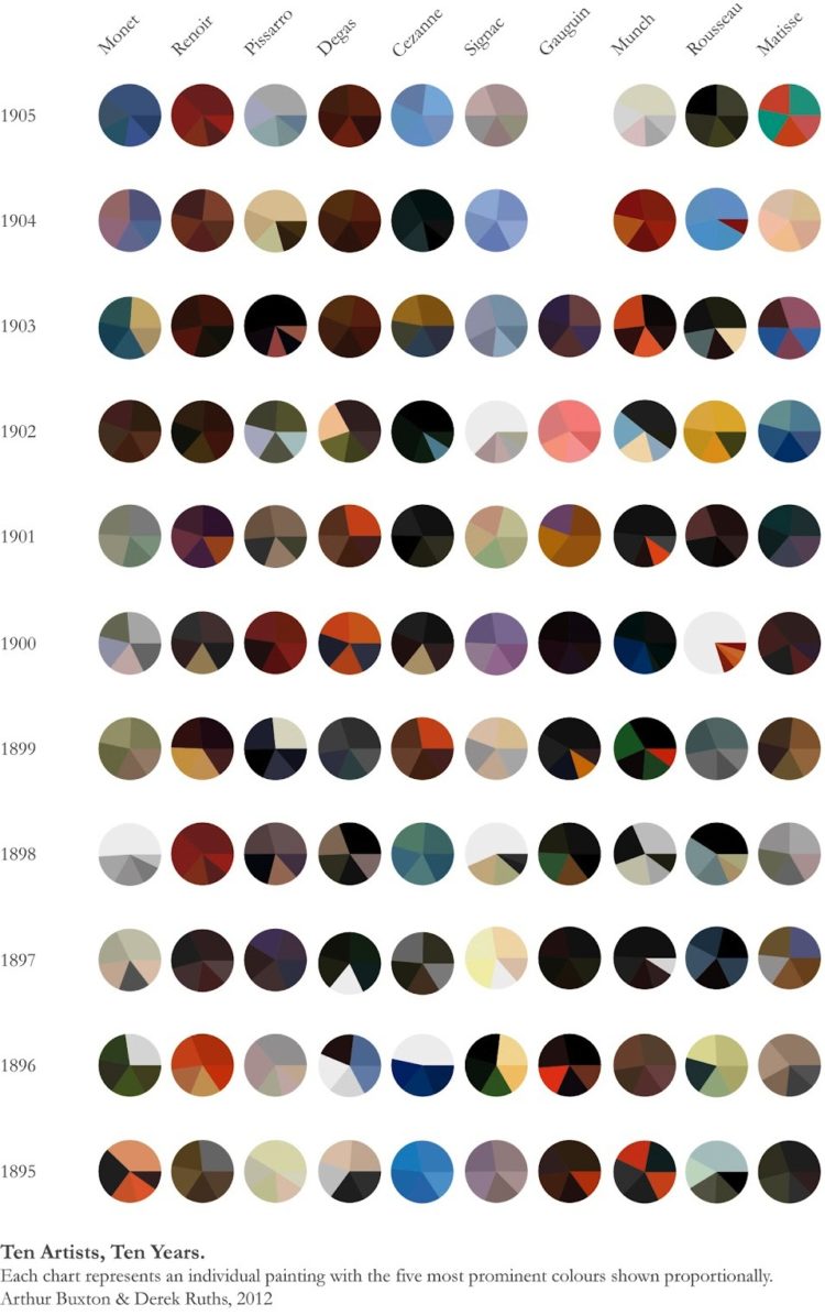
Expanding on his Vincent van Gogh pie charts, Arthur Buxton minimalized famous paintings from ten artists into more of everyone’s favorite chart type. The color distribution of each pie represents the five most used shades in each painting. Like the first time around, you’re either loving this or foaming at the mouth.

Second Edition
 Visualize This: The FlowingData Guide to Design, Visualization, and Statistics (2nd Edition)
 Visualize This: The FlowingData Guide to Design, Visualization, and Statistics (2nd Edition)
New tools, refined process.
Great work, may be you’d like to check our “painters time” http://www.visualizing.org/galleries/la-lettura-visual-data?start=41537 (one of the visualizations we publish on a suday column of corriere della sera) where we analyzed 8 centuries of art, depicting the life of each author by highlighting his most important painting (according to a famous Italian art encyclopedia) and the period of his life in which he made it along with the first result on googleimages for his name. This chart gives us a quick scan on the most used colors / tecniques / sizes scorsa centuries. if you like it we can translate it in english. (@giorgialupi)
While I appreciate the work that clearly went into this and the passion it displays, the exercise has little value other than as a semi-abstract piece of art. Or possibly an art buff quiz question. Without knowing if the paintings chosen are representative of an artist’s output in a given year, the points are not usefully able to be compared. So we can say “Monet produced a painting in 1895 that had a lot of orange in it”. That’s about it. Gorgeous but mostly about form rather than content. But what do I know about art?
(sorry the direct link to the specific visualization is http://www.visualizing.org/visualizations/painters-time )
I prefer the pop art version- “Wolfenstein 1D: The game that changed everything, converted to a one pixel line”
http://wonder-tonic.com/wolf1d/
I wish the dates went in chronological order (1895-1905) instead of the way it’s currently presented.
Unfortunately this is about as (un)useful as most pie charts. As a piece of art itself, it’s quite nice.
It’s an incredibly useful palette mixing chart for serious painters,
especially those interested in historical painting and mood.
It took me years to break down similar palettes by Rembrandt, Velasquez or Sargent.
Picasso’s are the hardest to deconstruct. Van Gogh’s the oddest and most surprising.
He uses a lot of acid green as a neutral.
Fine work, and so interesting.
I never would have thought that Renoir or Degas were so dark – Renoir’s are always full of flight and Degas always associates with blue tutus!