The electricity bill (or all utility bills, really) haven’t changed much over the years. It’s basically computer output. Power2Switch, a site that helps you compare electricity prices, took a stab at redesigning the barebones bill. (Don’t miss the comments in the FastCompany post.)
While a step in the right direction, the redesign still needs to go through the revision cycle a few more times.
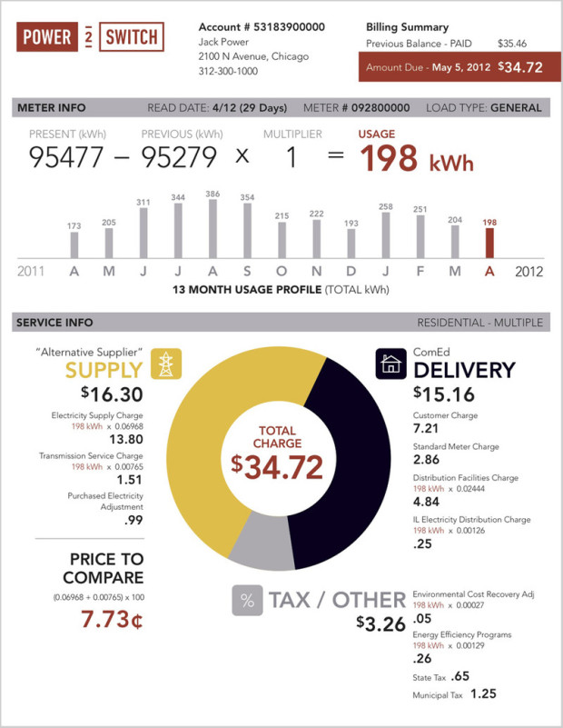
My first impression was that I wasn’t sure where to focus. There’s so much bold that my eyes bounced around trying to figure out what I was seeing. I get the visual hierarchy through different font sizes, but I don’t think it’s enough.
When I get an electricity bill, my first two questions are how much I owe and whether I owe more than I usually do. The first question is in red in the top right corner, and the second question is sort of answered with the previous balance above that. Only one previous month isn’t enough to see a pattern though.
You arguably could get that from the usage bar chart, but I don’t care how much electricity I used, and if price varies, I still don’t know the changes in cost from this bill alone. When I got my first few electricity bills after moving, for comparison, I asked others what they usually pay, not how many kilowatt hours they pay for. Speaking of which, local fluctuations could be useful here.
The service information section is the most confusing. I think the point is to show the cost breakdown for suppliers so that customers can make better-informed decisions, but what is an alternative supplier? Would it have been more useful to label total supply cost as total supply cost instead of price to compare?
Finally, the donut chart is just decoration. It’s argued that a visual element was added so that customers remember better, but they don’t need to remember the distribution of their bill. They can only change their supplier, so they only need to remember the total supply cost. The donut chart won’t help with that.
I’m all for a utility bill redesign, but at this point, I’d rather get the old one with supply services and total due highlighted.
 Visualize This: The FlowingData Guide to Design, Visualization, and Statistics (2nd Edition)
I agree that it’s a good idea, but I think overall it’s a terrible job, and agree with your points.
The bar chart is far larger than it needs to be, and tells you very little.
The donut chart is absurd, and following the text around the page is just frustrating.
It seems they took far too large a cue from cheap trendy infographics and far too little from the serious design world.
With this much clutter and confusion, I’d rather just have the original bill.
Haters gonna hate
That is a terribly useless thing to say.
Offering valid criticism of a failed design is not ‘hating’.
That’s really just a very stupid thing to say.
The design fails.
The article that we are commenting on states the very same thing.
If you’d care to address whatever points you disagree with, I’d be happy to explain further.
Try less rage, more reading other comments :-)
I don’t know what you’re interpreting as rage…?
Or as hate…?
I criticized the work. Just because I gave negative feedback does not make it rage or hate. It’s simple basic criticism. And nothing in the other comments has invalidated anything that I said.
While you are correct that you can make sense of the various components of the design, that is not a very strong statement. If you look at things in a certain light, you can eventually make sense of anything :)
Meant to add:
‘makes sense’ is a relative term.
Yes, you can make sense of what the bar chart is showing, of course, but does it make sense to fill that large a portion of the page with that bar chart? No.
The donut chart ‘makes sense’ in that yes, you can see how much of your bill is from which category. But does using a donut chart, especially one that takes of that much real estate. make sense for this data? No.
The bar chart could be half the size that it is, and it could display both KWH and cost, or if the rate is variable could be displayed on two small bar or line charts, one for usage, one for cost.
The donut chart could easily be replaced by a small bar chart.
The information that is surrounding the donut chart in an inexplicably complicated way could be organized into an easy to read table,a nd possibly additional small bar charts.
So, ‘you can make sense of it’ and ‘it makes sense’ end up being very different things.
I think the biggest problems here are copywriting, not design. It took a lot of staring and thinking to realise that in the donut, yellow simply means the actual cost of the electricity used (or estimated) and is the bit the customer can control, and black is logistical stuff that doesn’t vary (I think?). And “price to compare” is the unit cost of 1kwh with this supplier.
With this in mind, it makes sense. The bar chart is very useful – you can see how your usage varies through the year. If you’re trying to use less, you want to see clearly that your efforts are succeeding. If your usage has just spiked upwards, you want that to be presented to you, in context, clearly and prominently.
The donut is useful (if I’ve understood it right…) as it shows you how much of the cost you can actually influence. It’s the target, and the more yellow it is, the more impact your changes can have. If you’re keeping the yellow chunk small or reducing it, you’re doing something right. (this is assuming I’ve understood the rather confusing labels correctly)
I think “Alternative Supplier” is a placeholder for the name of the company or package that ComEd buy their electricity from.
Does the “Alternate Supplier” refers to the fact that some people have solar panels or other ways to generate electricity. Some locales require Utility companies to purchase any excess from these individual consumers that is pushed back onto the grid.
I think it’s a good starting point. Nathan, I love the idea about local fluctuations. Heck, you could make it a social game to compare your usage trends to the average of your neighbors. That could do a lot for reducing energy use!
Social utility network. Sounds great :)
The biggest shock for a European looking at this is that neither the original bill nor the re-designed one report greenhouse gas emissions. What is wrong with you Americans? Don’t you realise how much carbon dioxide you are pumping into the atmosphere? No, you don’t – because your energy suppliers don’t tell you.