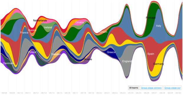
Nicolas Belmonte, a data visualization scientist at Twitter, visualized the change in tweet volume during Euro 2012. It starts with a streamgraph for an overall view, and when you click on a team you get a time series for each of that team’s matches. The selected team appears on top, and the team they are against is on the bottom. Goals are also marked adding context to the spikes.
I didn’t watch any of the championship and know next to nothing about soccer, but Belmonte’s piece is useful and fun to use. Would come again.
 Visualize This: The FlowingData Guide to Design, Visualization, and Statistics (2nd Edition)
Yo there, I’m on a never ending hunt to make interactive stream graphs and yours are supreme. I’m curious how you made them? Always lurve-ing your site.
I don’t get streamgraphs. I mean they look great. But they seem to take stacked area charts (which are frequently used when separate lines would be better) and then remove any sense of a baseline. Why?
There’s a balance to be found for sure. See Byron and Wattenberg’s paper for a proper discussion:
http://www.leebyron.com/else/streamgraph/
Ah yeah, Lee Byron is where first discovered them but didn’t see processing.js on your page so assumed you had some other method? Bit of a webular noob.
Life has no baseline; I think Stream graphs can be pretty great at pushing aside hierarchies and making you focus on open relationships between data though.
Still don’t get it. Graphs are meant to make comprehension and comparison of numbers and proportions easier. That’s simply not the case here. Take Spain for example. Its blob oscillates up and down. That should mean something. But it doesn’t because there’s no baseline. For Italy there’s up and down oscillations too. But the numbers of tweets either side of the third peak are (I’d guess) roughly the same. The graph adds things we are tuned to see as trends when there are none.
A main point of the paper is that a graph can mean more than analytical insight.
I would say that’s a main claim of the paper. Whether it’s true or not largely depends on your definition of graph.
From the OED: “a diagram showing the relation between variable quantities, typically of two variables, each measured along one of a pair of axes at right angles.”
Based on this definition, the obvious question is “does the figure show the relationship between variable quantities?” Well… maybe. But if it does it does so in a very obtuse way. So its a very poor graph at best. On the other hand it might be considered great (data) art.
Neat graphic and an area we’re also really interested in. Our data visualisations for Euro 2012 are on http://flumes.com/euro-2012/timeline. We include data about tweeter’s gender and location as well as top tweets, videos and picture.
It’s a shame the time series charts dont actually show the time, apart from when goals are scored. You could then clearly see when matches go into extra time and penalties instead of having to infer it from the length of the chart.