3-D pie charts are never a good idea? Ha. You just got served.
What 3-D pie charts are good for
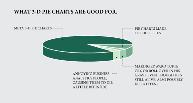
Chart Type Used

19 Comments
Second Edition
 Visualize This: The FlowingData Guide to Design, Visualization, and Statistics (2nd Edition)
 Visualize This: The FlowingData Guide to Design, Visualization, and Statistics (2nd Edition)
New tools, refined process.
They also make tasty linkbait.
3D pie charts are very good at one thing, as we datavis people all know. It’s to make information difficult to decode. when you have information that you have to publish, and you don’t really want people to compare categories, or in any way help them analyse it, bam! 3D pie chart. put the category that you want to look smaller on top, the one you want to look largest on the bottom. You’ve done your job on releasing data, using a conventional form, and probably with some decent aesthetics.
In a way 3D pie charts are the small blue typeface at the end of contracts. Definitely less legible and informative, but undoubtedly useful, at least from one perspective. After all, all information is not meant to be equal.
Well said. One of the only things better is a page full of tables in small fonts.
This pie chart could obviously be improved by using a better font, such as Comic Sans.
Brilliant!!!
Reply of the century! You made my day! :-)))
At least the designer had the good sense to make the label text ALL CAPS. ;-)
Should have used a legend, so the pie isn’t cluttered with those labels and leader lines.
As a Business Analytics type, I died a little inside when I saw your post title. so from that sense, this 3-D pie is very effective. thanks for the laugh
I love Jerome’s comment that “3D pie charts are the small blue typeface at the end of contracts.” Jerome – may I use that in my seminars?
i would have preferred different colours, perhaps florescent yellow with white.
You need a shiny reflective effect on the surface and a lens flare to really communicate the data.
as a scientist who has to communicate data with charts and graphs on a daily basis, I agree that in many cases pie charts are over used and abusted
however, for some things they are a good idea;
I have read tufte and think he is a poseur; he presents his ideas, which are just that, as dogma
I’m to lazy now to dig out all the refs on charting, going back into the dark ages of exploratory data analysis, but all you anti piests are arrogant and stupid, cause you are dissing something without really understanding why
You didn’t get the point. The point is “3-D” – is manipulative.
You obviously don’t understand what you’re talking about.
Stephen Few has a great article on why pie charts are ineffective and inaccurate. Primarily, it has to do with simple geometry and cognitive perception: the eye interprets the length of the arc rather than the quantity represented by the arc. If used, pies should never show quantities (i.e. 38% of this and 22% of that), but rather only to show relative relationship of parts to the whole.
Should have spun the pie so that the skinny segments are safeky parked out of view, right round the back.
…And kept spinning it, with some clever giffyness, perhaps enhanced by cycling through different rainbow colors.
Yes, 3D pies are misleading in static form. But in other forms (transition/exploration vs. presentation), I think they can actually be quite efficient spatially and effective from a UX perspective.