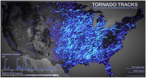
John Nelson of IDV Solutions put 56 years worth of tornadoes on a map. John plotted each tornado’s path and used brightness for its F-scale (level of intensity). He also added secondary charts for deaths and injuries and frequency by F-scale.
It makes a gorgeous map. I would love to see the data incorporated into the wind map.
So… practically speaking, if you live in the Midwest or Southern US, you should probably put this on your reading list.
 Visualize This: The FlowingData Guide to Design, Visualization, and Statistics (2nd Edition)
Excellent choice with the dark background and lightness by F scale. The blue is gorgeous and the symbolization very effective.
A few things that would make this even better – use a map projection that does not cause excessive E-W distortion in the northern part of the country. The relative density and intensity of Tornadoes is diminished in the northern section of the country making it extremely difficult to compare to the southern section. The hillshade base is also distracting. Cheers, Karen
are tornado tracks really that straight?
Are tornado tracks really that long? Are these rather the tracks of the storm systems that spawned the tornadoes?
We’ve recently made an interactive version of this map, where you can navigate the geography and time of this data and filter by attributes like severity, magnitude, loss, and cost -if you are so inclined.
http://uxblog.idvsolutions.com/2012/07/interactive-tornado-tracks-map-is-live.html